Fig. 7.
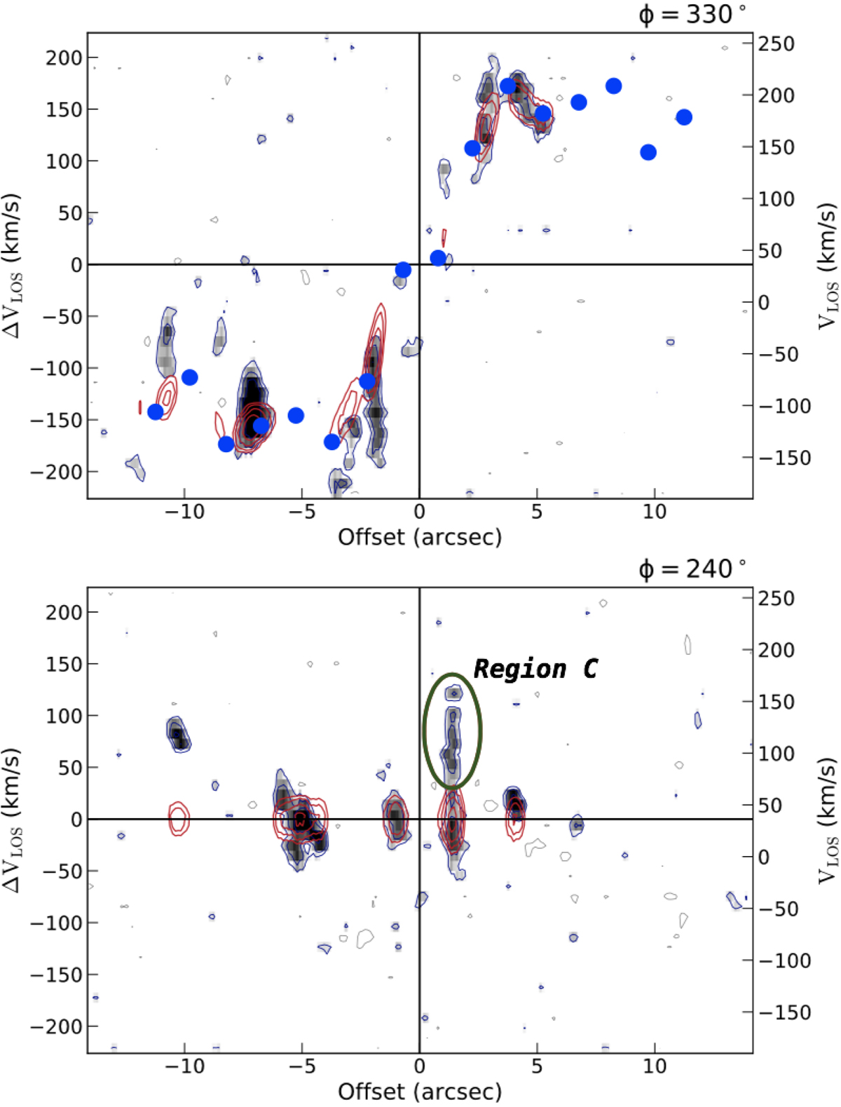
PV diagrams on the major (top panel) and minor (bottom panel) axis, respectively. On the x-axis, the angular distance from the centre of the source along the direction fixed by the angle ϕ is reported. On the right y-axis, the velocity along the line of sight (in km s−1) is shown as it appears in the input data cube. On the left, the velocity along the line of sight (in km s−1) is shown, once the systemic velocity (vsys = 36 ± 10 km s−1) has been subtracted. The data are represented in grey scales with blue contours, while the best fit model is identified by red contours. Upper panel: the blue circles represent the projected best fit rotational velocity at different radial distances from the centre, associated with each ring of the disc. Bottom panel: the signature of the potential outflow associated with Region C (bordered in green; see Sect. 4.3) is clearly visible as an excess of CO emission over 100 km s−1 with an offset of ∼1″ from the centre of the rotation.
Current usage metrics show cumulative count of Article Views (full-text article views including HTML views, PDF and ePub downloads, according to the available data) and Abstracts Views on Vision4Press platform.
Data correspond to usage on the plateform after 2015. The current usage metrics is available 48-96 hours after online publication and is updated daily on week days.
Initial download of the metrics may take a while.