Fig. 6.
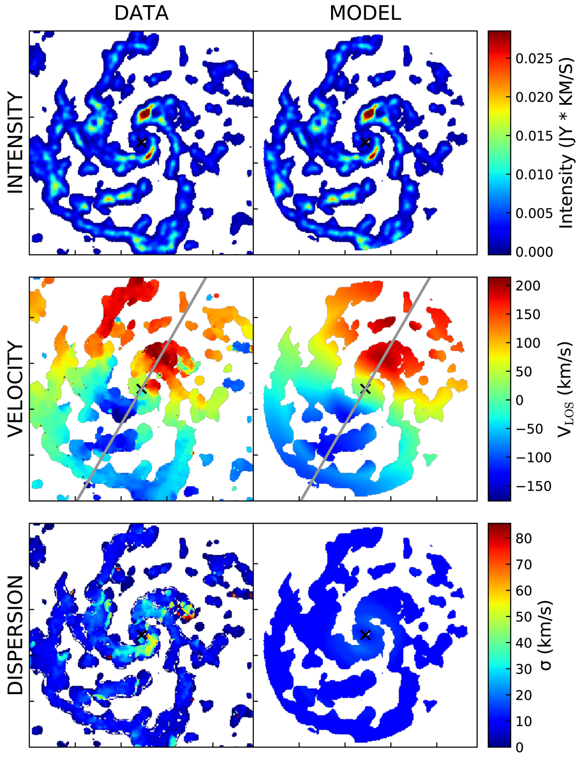
From top to bottom: comparison between the flux, velocity, and velocity dispersion maps obtained from the data (left column) and the best fit model produced by the 3DBAROLO code (right column). Both the data and model have been convolved with an elliptical Gaussian twice the size of the beam of the observation. This smoothing procedure helps the 3DBAROLO in the fitting procedure, especially in the case of clumpy emission as the one analysed here. The grey lines in the central panels represent the direction of the position angle; the same slit was used to extract the position-velocity (PV) diagram on the major axis, as presented in the top panel of Fig. 7.
Current usage metrics show cumulative count of Article Views (full-text article views including HTML views, PDF and ePub downloads, according to the available data) and Abstracts Views on Vision4Press platform.
Data correspond to usage on the plateform after 2015. The current usage metrics is available 48-96 hours after online publication and is updated daily on week days.
Initial download of the metrics may take a while.