Fig. 4
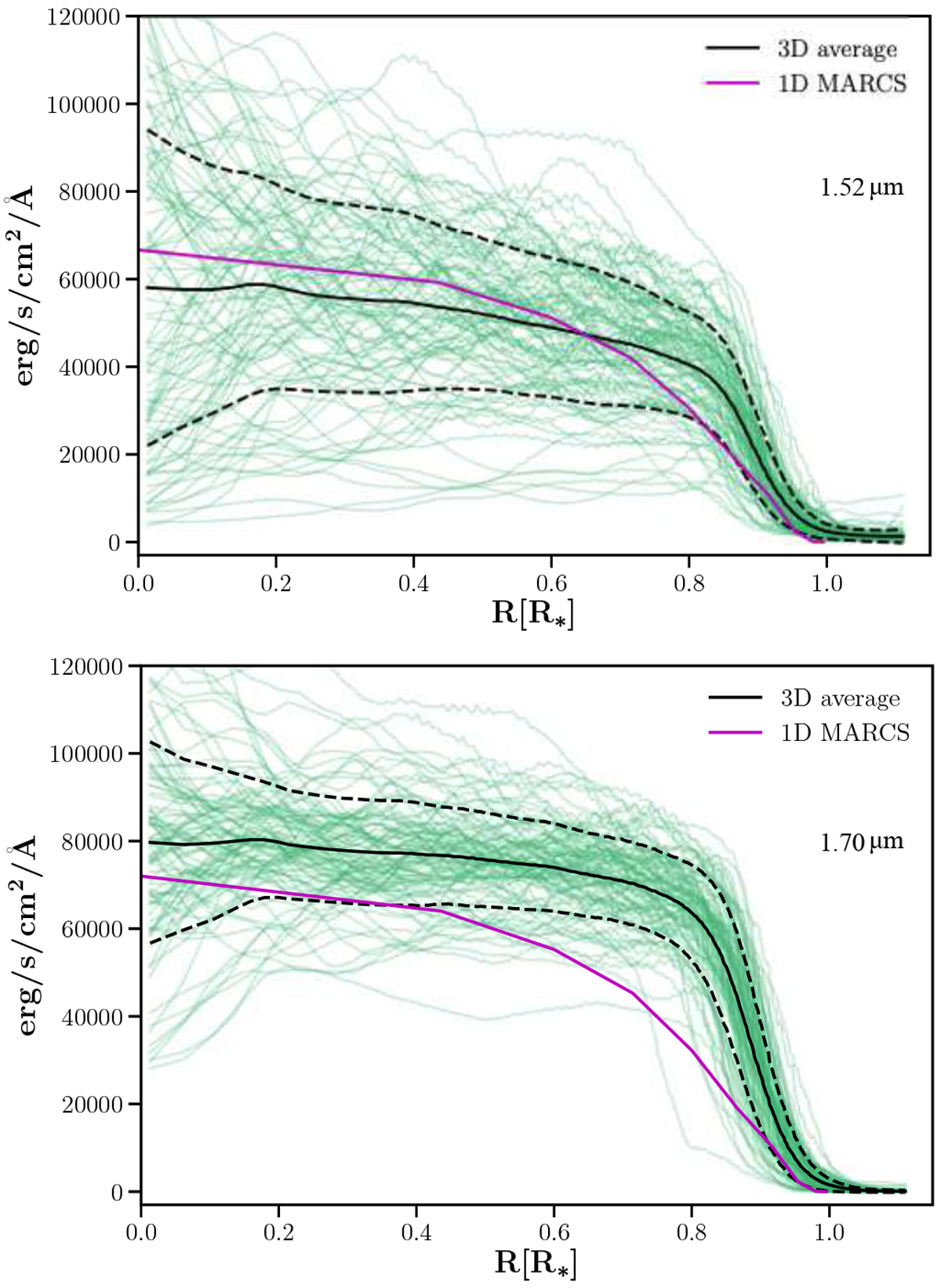
Azimuthally averaged intensity profiles (green curves) obtained from the intensity map of each simulation snapshot of Table 3. The black curve is the temporally averaged intensity profile, while the dashed black lines denote the 1-σ temporal fluctuations. The purple line in the 1D intensity profile from the best-fitting MARCS model (see text).
Current usage metrics show cumulative count of Article Views (full-text article views including HTML views, PDF and ePub downloads, according to the available data) and Abstracts Views on Vision4Press platform.
Data correspond to usage on the plateform after 2015. The current usage metrics is available 48-96 hours after online publication and is updated daily on week days.
Initial download of the metrics may take a while.