Fig. 7.
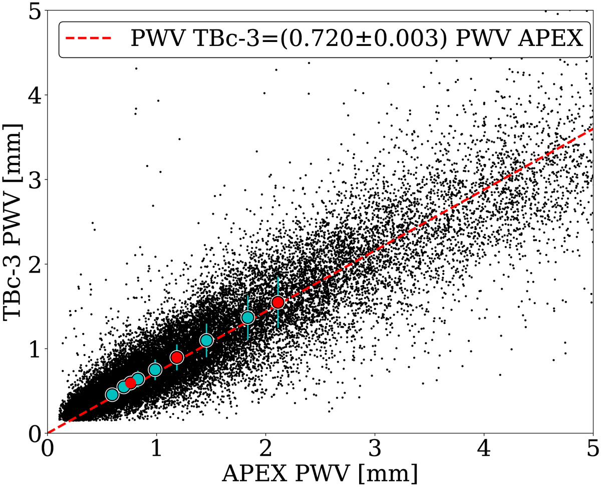
PWV comparison between Cerro Chajnantor and the plateau. Data from 2009 to 2012 are included in this figure. The cyan circles are the PWV quantiles used in linear regression. The red circles indicate the quartiles (25%, 50%, and 75%). Error bars are y-axis standard deviation for each quantile. The slope in this graph denotes the significant drop in PWV at the Cerro Chajnantor summit as opposed to the Chajantor plateau, with a 505 m difference.
Current usage metrics show cumulative count of Article Views (full-text article views including HTML views, PDF and ePub downloads, according to the available data) and Abstracts Views on Vision4Press platform.
Data correspond to usage on the plateform after 2015. The current usage metrics is available 48-96 hours after online publication and is updated daily on week days.
Initial download of the metrics may take a while.