Free Access
Fig. A.1.
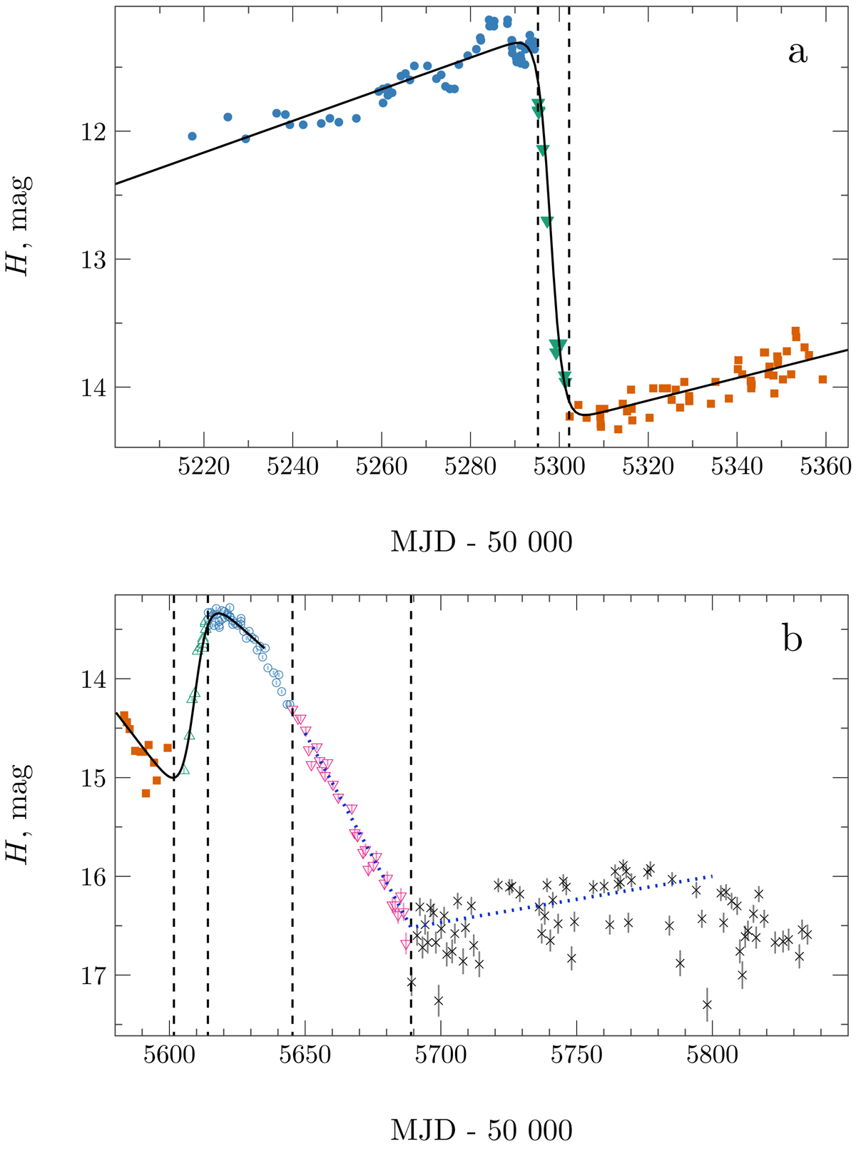
Example of the phase separation during (a) rise and (b) decay of the 2010–2011 outburst. Colors and symbols are the same as in Fig. 4. The solid black line and dotted blue line (panel b) show the fitted models given by Eq. (A.1). Vertical dashed lines correspond to the boundaries between different phases.
Current usage metrics show cumulative count of Article Views (full-text article views including HTML views, PDF and ePub downloads, according to the available data) and Abstracts Views on Vision4Press platform.
Data correspond to usage on the plateform after 2015. The current usage metrics is available 48-96 hours after online publication and is updated daily on week days.
Initial download of the metrics may take a while.