Fig. C.1.
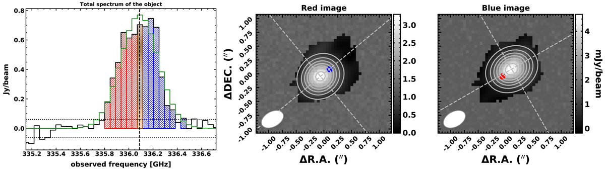
Integrated spectrum and red/blue maps of SDSS J0923+0247. Left panel: the data and the best-fit model is shown with black and green lines, respectively. The red dashed vertical line indicates the central frequency; the rms of the residuals is indicated by the dotted horizontal lines. Channels used to create the red and blue maps (show on the right panels) are filled with their respective colours. The central brown bin is added to the red and blue side of the collapsed images with a weight given by the fraction of red and blue bins. Right panels: the best 2D Gaussian model is shown with white contours. The blue and red circles indicate the centroid positions of the counterpart map. Here, pixels not defined in the maps are replaced with simulated noise in order to avoid numerical drawbacks in the fitting process.
Current usage metrics show cumulative count of Article Views (full-text article views including HTML views, PDF and ePub downloads, according to the available data) and Abstracts Views on Vision4Press platform.
Data correspond to usage on the plateform after 2015. The current usage metrics is available 48-96 hours after online publication and is updated daily on week days.
Initial download of the metrics may take a while.