Fig. 5
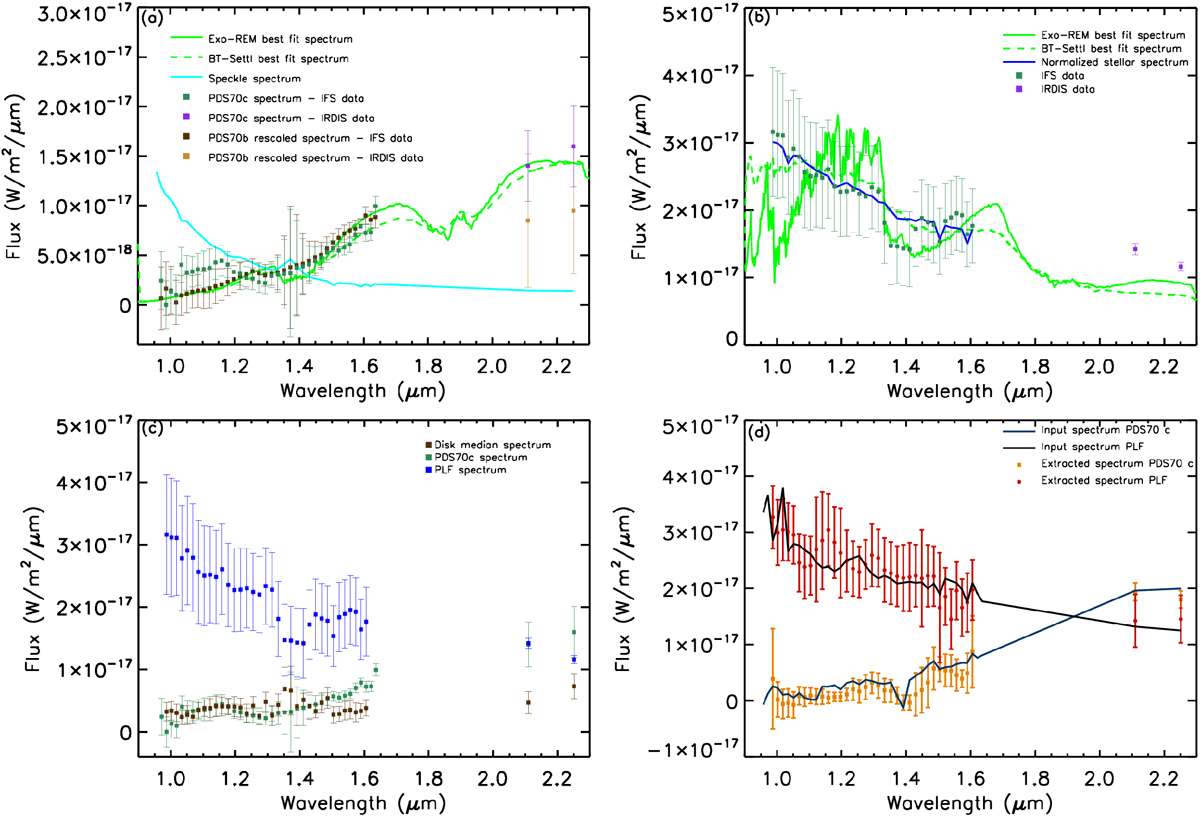
Panel a: extracted spectrum of PDS 70 c both with IFS (green squares) and IRDIS (violet squares). The green solid line represents the best fit Exo-REM model while the green dashed line is the best fit BT-Settl model. The parameters of the best-fit models are listed in the text (Sect. 4.1). The cyan solid line represents an extracted spectrum for a speckle from the same dataset. We also overplot the rescaled spectrum of PDS 70 b both for IFS (deep brown squares) and IRDIS (light brown squares). Panel b: same as panel a but for the PLF spectrum. We plot as a blue solid line the stellar spectrum normalized to the companion flux to demonstrate their similarity. Panel c: comparison between the extracted spectra for PDS 70 c and the PLF and the spectrum obtained making a median of ten different positions of the disk. Panel d: comparison between the injected spectrum of a simulated planet in a position similar to PDS 70 c with respect to the disk (deep blue solid line) and the relative extracted spectrum (orange squares). The same thing is done for a simulated planet at a similar position of the PLF (black solid line and red circles).
Current usage metrics show cumulative count of Article Views (full-text article views including HTML views, PDF and ePub downloads, according to the available data) and Abstracts Views on Vision4Press platform.
Data correspond to usage on the plateform after 2015. The current usage metrics is available 48-96 hours after online publication and is updated daily on week days.
Initial download of the metrics may take a while.