Fig. 2.
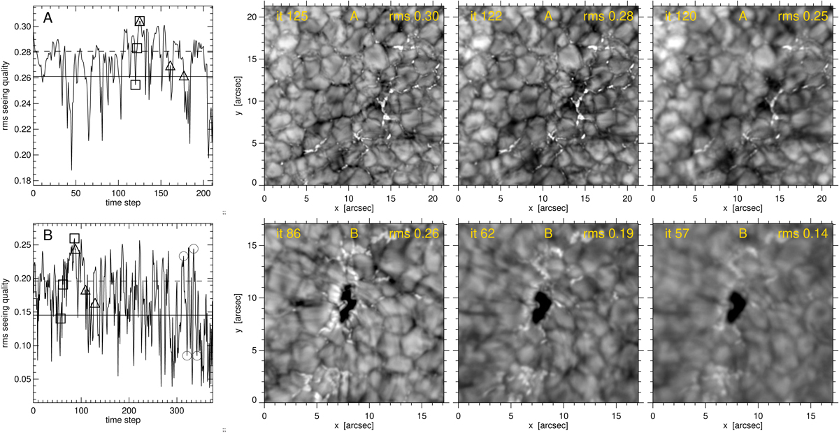
Seeing quality for data A (upper row) and data B (lower row). First column: root mean square contrast variation against time for the wide-band Hα image sequences. The rms units are arbitrary per data set. The solid horizontal lines show thresholds for discarding the worst images (25% for data A, 33% for data B). The dashed lines show the mean rms for the remaining images. Other panels: corresponding image center cutouts at the best seeing, seeing near the mean-above-threshold value, and seeing near the threshold value, sampled at the times marked by three squares in the graphs that are close for sampling the same solar scene. The three triangles in the upper graph mark the samples in the upper row of Fig. 1. The three triangles in the lower graph mark the samples of the Pub B PHE, contrail fibril, and return aftermath shown in Figs. 1 and 7. The two pairs of circles at the right mark 4 min delay pairs at good and poor seeing used in Fig. 7. The image greyscales along rows share the clipped byte scaling of the sharpest images at the left, including saturation of the pore in the lower row to boost granular contrast.
Current usage metrics show cumulative count of Article Views (full-text article views including HTML views, PDF and ePub downloads, according to the available data) and Abstracts Views on Vision4Press platform.
Data correspond to usage on the plateform after 2015. The current usage metrics is available 48-96 hours after online publication and is updated daily on week days.
Initial download of the metrics may take a while.