Fig. 4
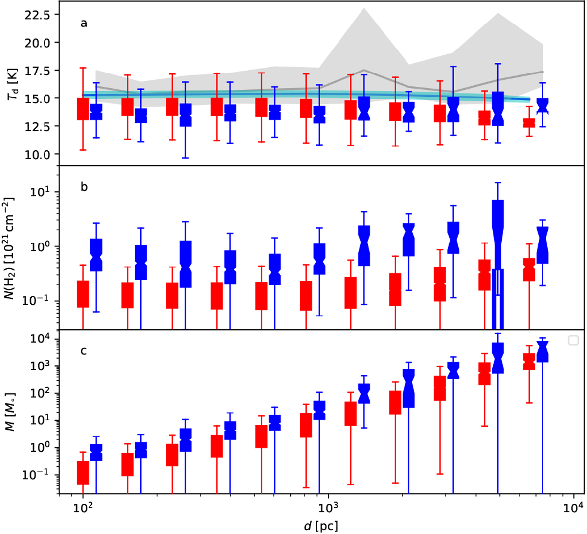
Comparison of clump temperature, column density, and mass as functions of cloud distance. The red boxplots correspond to the simulated sample and the blue boxplots to the PGCC. Frame a: the grey shading and the cyan shading indicate theinterquartile intervals of the background temperature in the PGCC and in simulations, respectively. The median values are drawn with solid lines.
Current usage metrics show cumulative count of Article Views (full-text article views including HTML views, PDF and ePub downloads, according to the available data) and Abstracts Views on Vision4Press platform.
Data correspond to usage on the plateform after 2015. The current usage metrics is available 48-96 hours after online publication and is updated daily on week days.
Initial download of the metrics may take a while.