Fig. 5.
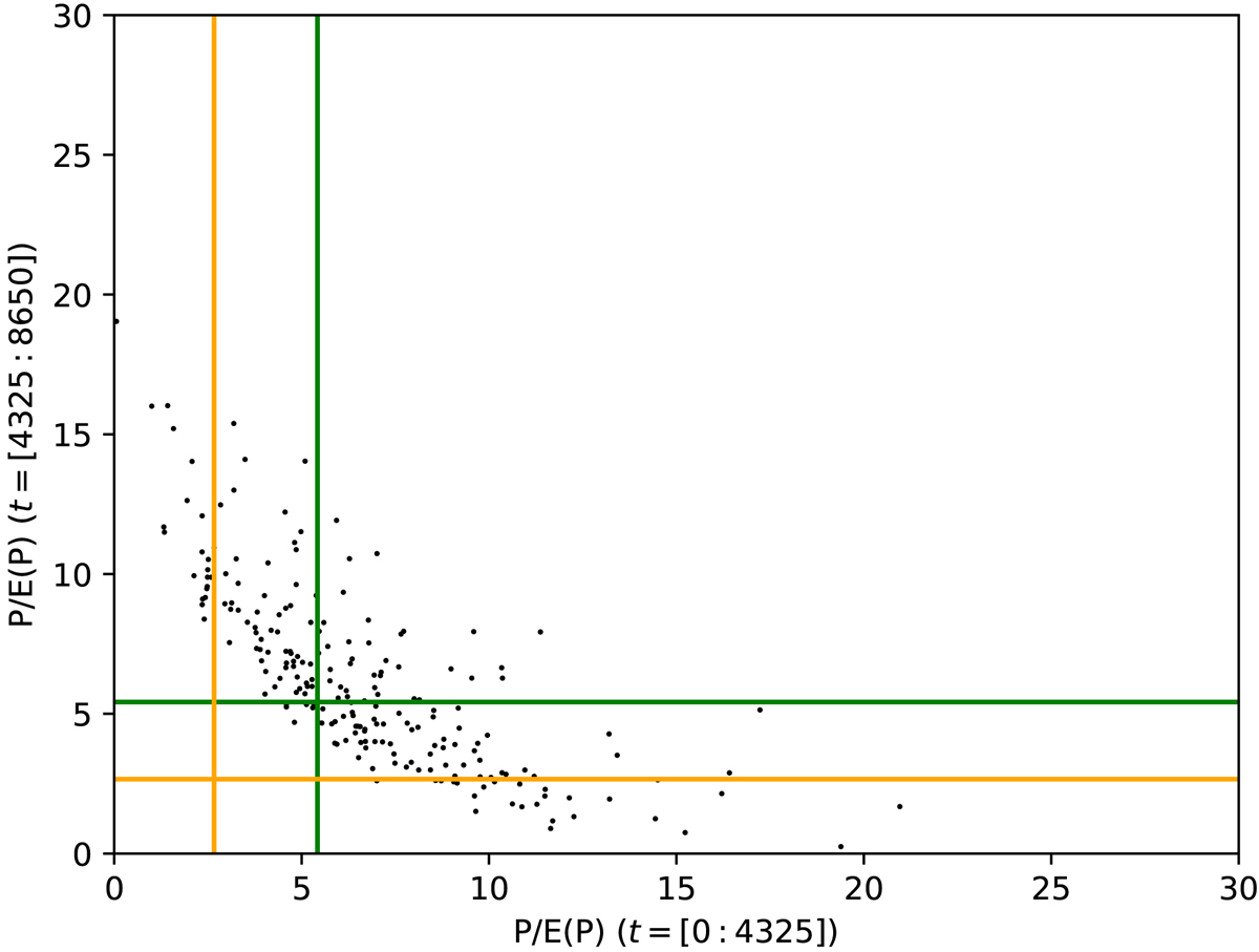
Period analysis of subseries from realizations of the NNF model. Each point in the diagram corresponds to one of the 216 highest peaks with periods above 40 years in the normalized power spectra (power divided by the expectation value given by the median) from 1000 realizations. They are plotted according to the normalized power at the same period in the first half (horizontal axis) and in the second half (vertical axis) of the 10 000 years full series. The distribution of the points show that significant power in the full series in most cases corresponds to high power in both subseries. 84% of all points in the power spectrum from the two subseries lie beneath (to the left of) the orange horizontal (vertical) line and 97.7% lie beneath (to the left of) the green lines.
Current usage metrics show cumulative count of Article Views (full-text article views including HTML views, PDF and ePub downloads, according to the available data) and Abstracts Views on Vision4Press platform.
Data correspond to usage on the plateform after 2015. The current usage metrics is available 48-96 hours after online publication and is updated daily on week days.
Initial download of the metrics may take a while.