Fig. 8.
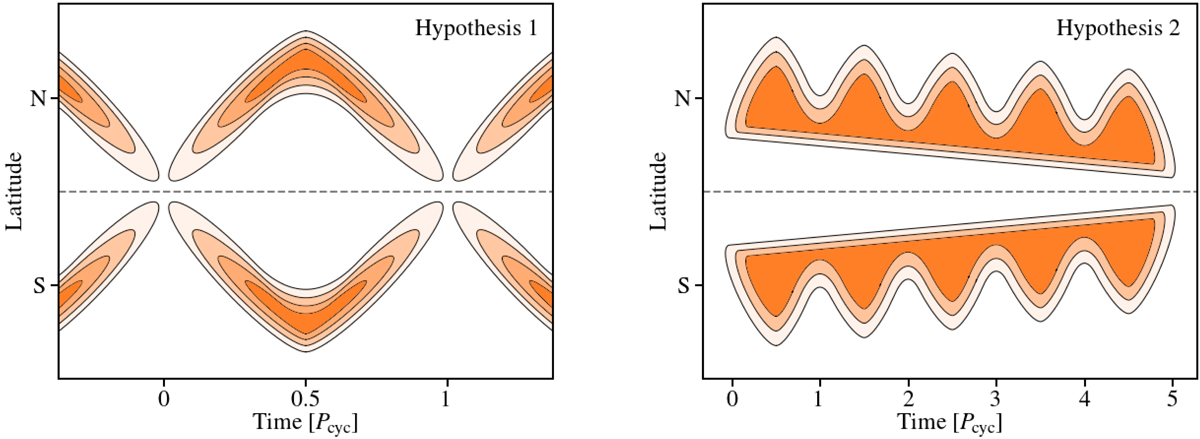
Qualitative illustrations of spot emergence patterns based on Hypothesis 1 (left panel) and Hypothesis 2 (right panel) as discussed in Sect. 5.3. In both cases we assume a slowly rotating pole compared to the equator (similar to the Sun). Darker shades indicate higher activity levels (e.g., higher spot emergence rates). For the depiction of Hypothesis 2, we use the solar-like butterfly diagram simply as an example to describe the overall change in emergence latitude caused by the primary cycle.
Current usage metrics show cumulative count of Article Views (full-text article views including HTML views, PDF and ePub downloads, according to the available data) and Abstracts Views on Vision4Press platform.
Data correspond to usage on the plateform after 2015. The current usage metrics is available 48-96 hours after online publication and is updated daily on week days.
Initial download of the metrics may take a while.