Fig. 2
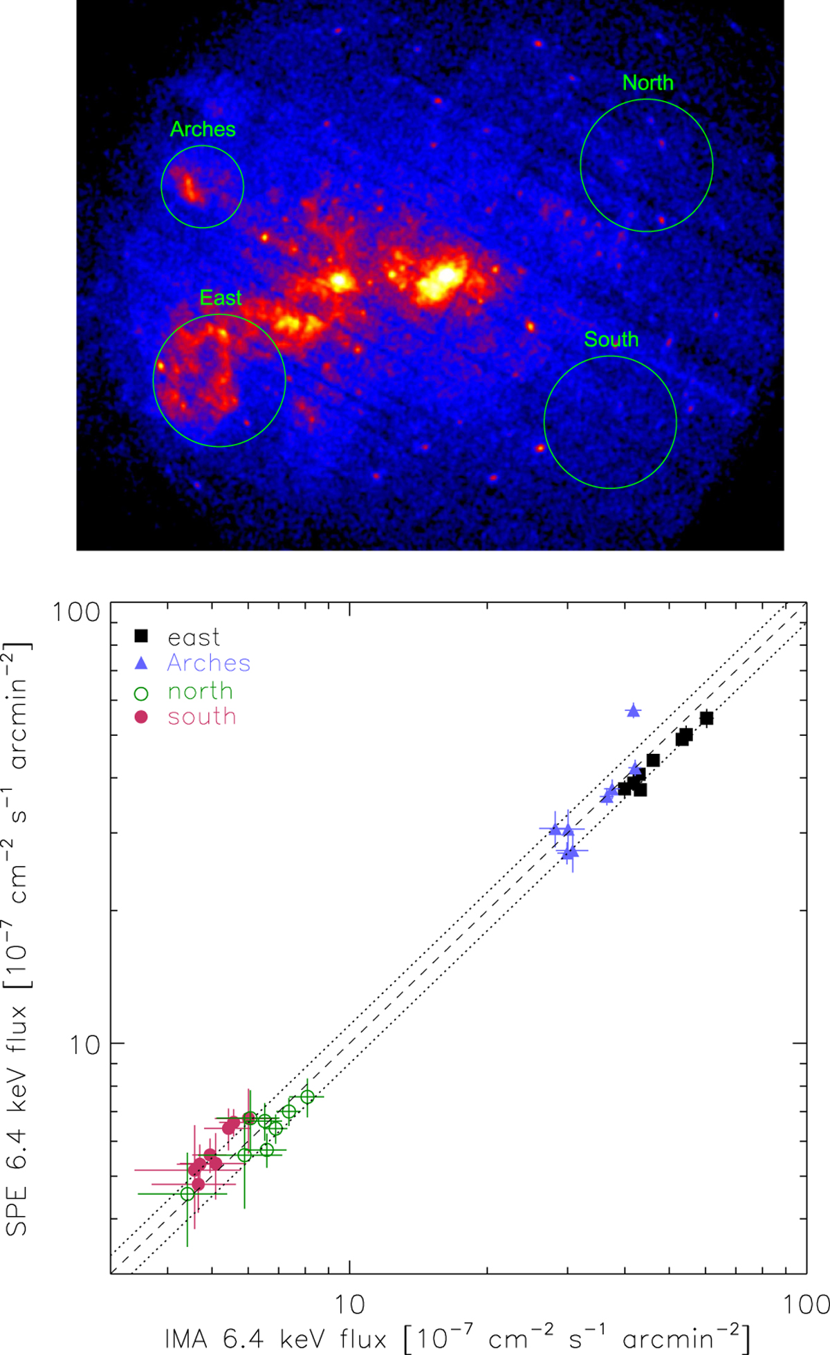
Comparison of the Fe Kα fluxes extracted from the mosaic images with those obtained from the spectral fitting for the four test regions within 12′ of Sgr A⋆ visible in the inset. The data have been grouped into eight periods as described in the text (with the 2012 data split between the March and autumn observations). The dashed line indicates where regions with the same fluxes from imaging andspectral analysis should lie and the dotted lines represent the 10% dispersion around it.
Current usage metrics show cumulative count of Article Views (full-text article views including HTML views, PDF and ePub downloads, according to the available data) and Abstracts Views on Vision4Press platform.
Data correspond to usage on the plateform after 2015. The current usage metrics is available 48-96 hours after online publication and is updated daily on week days.
Initial download of the metrics may take a while.