Fig. 10
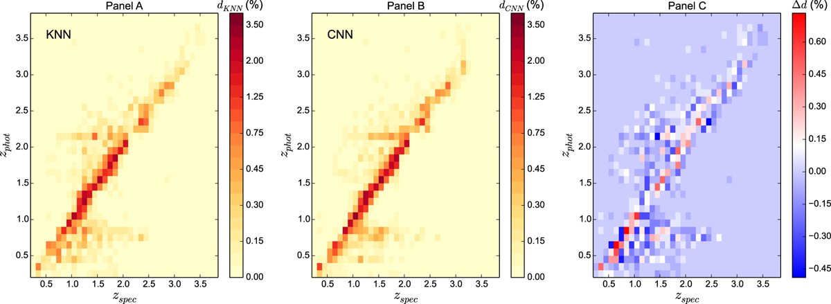
Panels A and B: comparison of the photometric redshifts predicted by the KNN and the CNN respectively against thespectroscopic redshifts. The color indicates the density of quasars in percentages. Redder the color, higher the density of quasars is. The line y = x is red which means that the density of quasars is the highest and so the two methods well estimate most of the photometric redshifts compared to spectroscopic redshifts. Panel C: difference in percentages between the density of quasars given by the CNN and the density of quasars obtained by the KNN, noted Δd. In other words, when Δd is positive (resp. negative), the color is red (resp. blue), and it means that the density of quasars given by the CNN (resp. KNN) is higher than those obtained by the KNN (resp. CNN).
Current usage metrics show cumulative count of Article Views (full-text article views including HTML views, PDF and ePub downloads, according to the available data) and Abstracts Views on Vision4Press platform.
Data correspond to usage on the plateform after 2015. The current usage metrics is available 48-96 hours after online publication and is updated daily on week days.
Initial download of the metrics may take a while.