Fig. 2
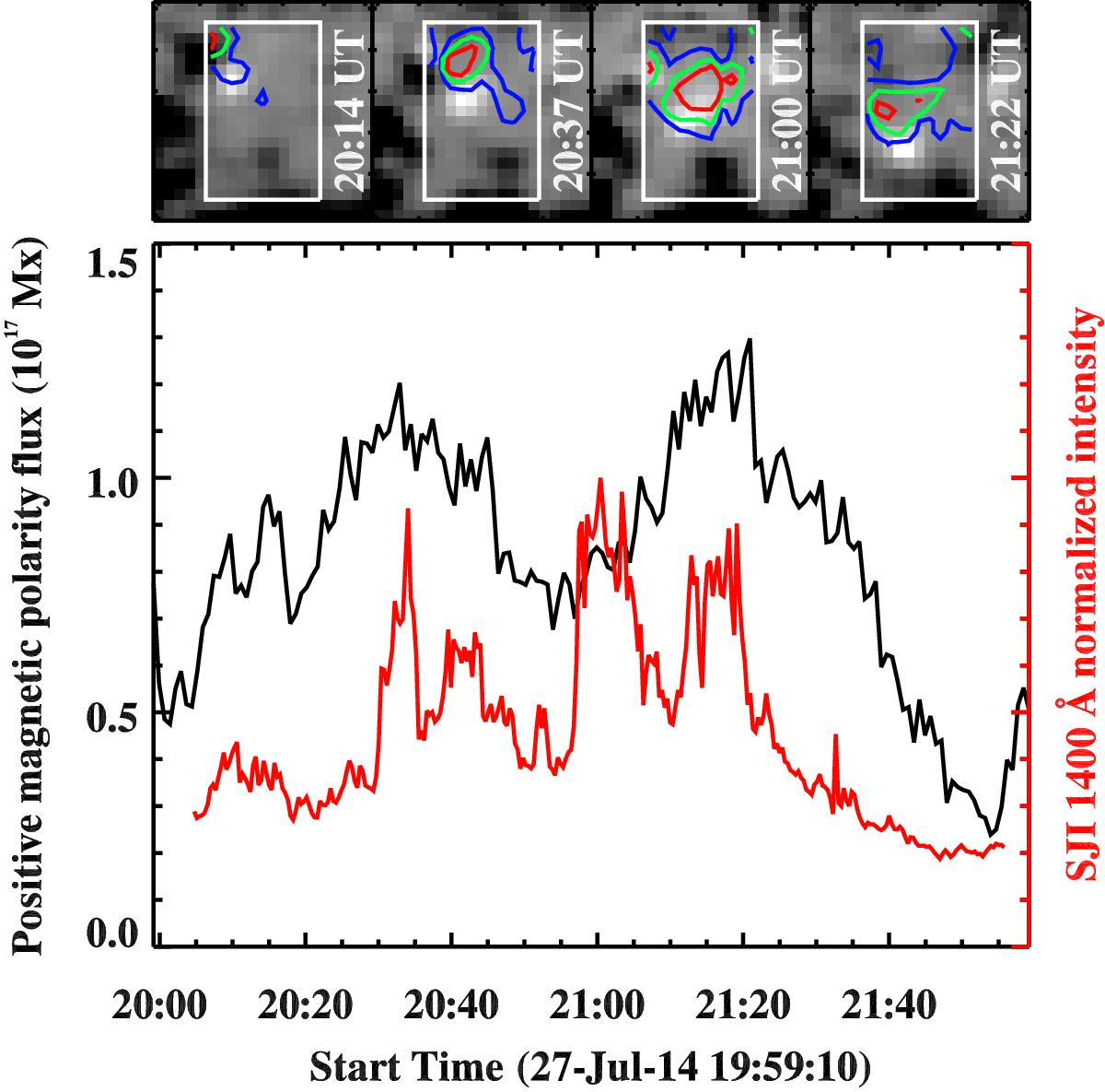
Temporal evolution of the UV burst and the underlying magnetic field. The top panel shows a series of HMI line-of-sight magnetograms saturated at ±250 G, recorded at times as indicated in the respective tiles. The white box outlines the region with parasitic positive magnetic polarity underlying the UV burst. The location of the burst as seen in co-temporal IRIS SJI 1400 Å images is highlighted with contour lines. The blue, green, and red contours indicate SJI intensities of 100 DN, 200 DN, and 500 DN, respectively. The field of view covered by each tile is marked with a smaller yellow box in Figs. 6 and 7 and has an area of 10.6′′×10.6′′. The black curve in the bottom panel is the spatially averaged magnetic flux of the positive polarity magnetic field in the region outlined by the white box (top panel). Only pixels with a magnetic flux density above 15 G are considered for the averaging. The red curve is the time series of SJI intensity normalised to its maximum, showing the evolution of the UV burst (see also Fig. 10). A two-hour-long time sequence of the magnetic maps displayed in the top panel is available as an online movie. See Sect. 2.1.
Current usage metrics show cumulative count of Article Views (full-text article views including HTML views, PDF and ePub downloads, according to the available data) and Abstracts Views on Vision4Press platform.
Data correspond to usage on the plateform after 2015. The current usage metrics is available 48-96 hours after online publication and is updated daily on week days.
Initial download of the metrics may take a while.