Fig. 12
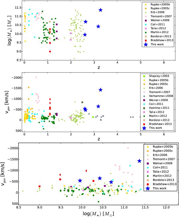
Comparison of gas outflow velocities derived for galaxies in different studies. Top: stellar mass versus redshift; middle: outflow velocities versus redshift; bottom: outflow velocities versus stellar mass. In the two lower panels, the y-axis is inverted, and a negative velocity indicates gas flowing towards us, i.e. outflows. Circles correspond to individual galaxies, squares to average measurements in composite spectra, triangles to measurements of a shift between emission and absorption lines in individual galaxies, and the star-like symbols to the results in this work. The two diamond symbols are subsamples of Bradshaw et al. (2013) containing only SF galaxies. We note that the two highest outflow velocities from Rupke et al. (2005b, ~5000 km s-1 and ~10 000 km s-1) are out of range in our plots.
Current usage metrics show cumulative count of Article Views (full-text article views including HTML views, PDF and ePub downloads, according to the available data) and Abstracts Views on Vision4Press platform.
Data correspond to usage on the plateform after 2015. The current usage metrics is available 48-96 hours after online publication and is updated daily on week days.
Initial download of the metrics may take a while.