Fig. 3
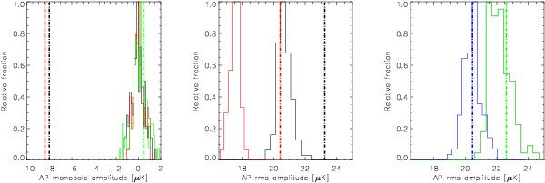
Colour coding common for all panels: black corresponds to the 100 GHz channel; red to 143 GHz; green to 217 GHz; and blue to the 2D-ILC map. Histograms are obtained from AP output at 100 displaced positions, while vertical dot-dashed lines correspond to AP outputs obtained on the clusters. The left panel refers to the AP output monopole/average, whereas the middle and right ones display histograms built upon rms estimates.
Current usage metrics show cumulative count of Article Views (full-text article views including HTML views, PDF and ePub downloads, according to the available data) and Abstracts Views on Vision4Press platform.
Data correspond to usage on the plateform after 2015. The current usage metrics is available 48-96 hours after online publication and is updated daily on week days.
Initial download of the metrics may take a while.