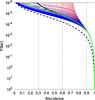
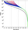
Fig. 12
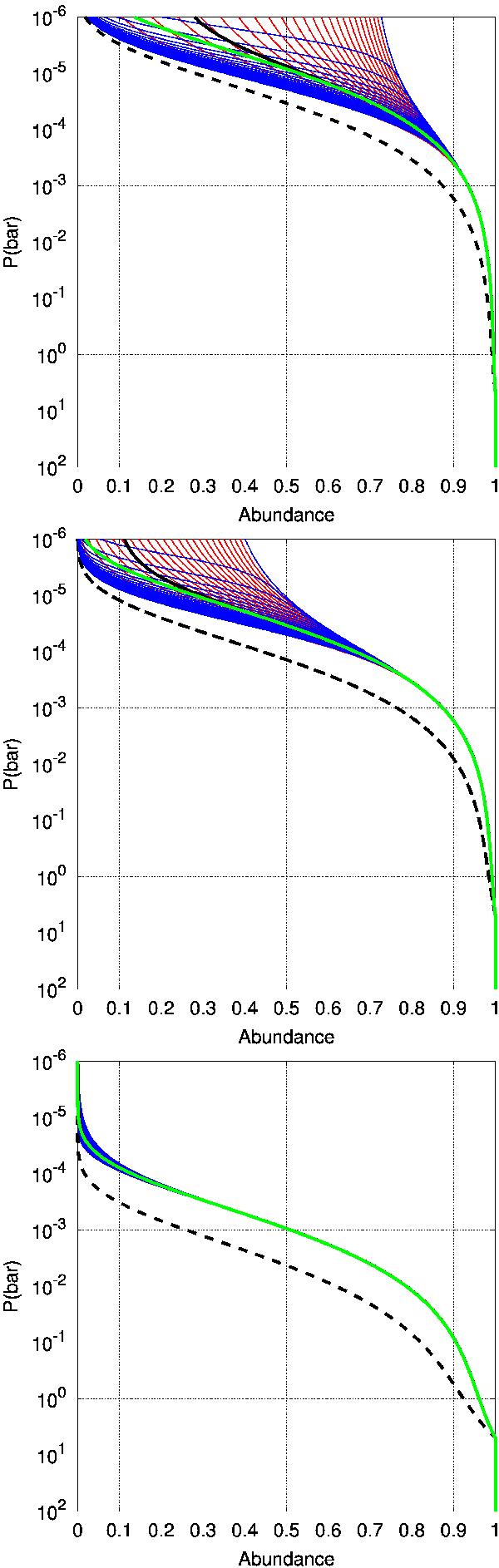
Tracer abundance in the advected column of gas from the 1D model as a function of time. From bottom to top we used  and a particle radius on the nightside of 1μm. We plot one profile every hour, corresponding to the profiles at equally spaced longitudes. The blue ones are on the nightside, the red ones on the dayside. The curve at the far left (right) of the envelope is the profile at the east (west) terminator. The black curve is the mean over one period. The green line is the analytical model (see Eq. (15)using α = 1/2) and the dotted line is the solution for particles that would be constantly falling (both in the dayside and in the nightside).
Current usage metrics show cumulative count of Article Views (full-text article views including HTML views, PDF and ePub downloads, according to the available data) and Abstracts Views on Vision4Press platform.
Data correspond to usage on the plateform after 2015. The current usage metrics is available 48-96 hours after online publication and is updated daily on week days.
Initial download of the metrics may take a while.