Fig. F.1
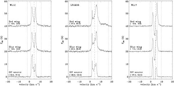
Overview of relevant outflow spectra. Each diagram shows from top to bottom the strongest red wing spectrum, the strongest blue wing spectrum and an off-source spectrum. νsource (dashed line) and the integration limits (dotted lines) are indicated. A dash-dotted line indicates the baseline. Positions of each spectrum are indicated in parentheses.
Current usage metrics show cumulative count of Article Views (full-text article views including HTML views, PDF and ePub downloads, according to the available data) and Abstracts Views on Vision4Press platform.
Data correspond to usage on the plateform after 2015. The current usage metrics is available 48-96 hours after online publication and is updated daily on week days.
Initial download of the metrics may take a while.