Fig. 15
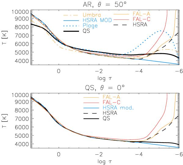
Comparison of temperature stratifications. Bottom: QS maps. Top: one of the AR maps. Thick black line: average QS temperature in the LTE fit. Blue line: modified HSRA model. Dashed line: original HSRA model. Red line: FAL-C. Orange line: FAL-A. For the AR, the average temperature stratification of a plage area (blue-dotted line) and of the umbra are over-plotted (orange-dash-dotted line).
Current usage metrics show cumulative count of Article Views (full-text article views including HTML views, PDF and ePub downloads, according to the available data) and Abstracts Views on Vision4Press platform.
Data correspond to usage on the plateform after 2015. The current usage metrics is available 48-96 hours after online publication and is updated daily on week days.
Initial download of the metrics may take a while.