Fig. 14
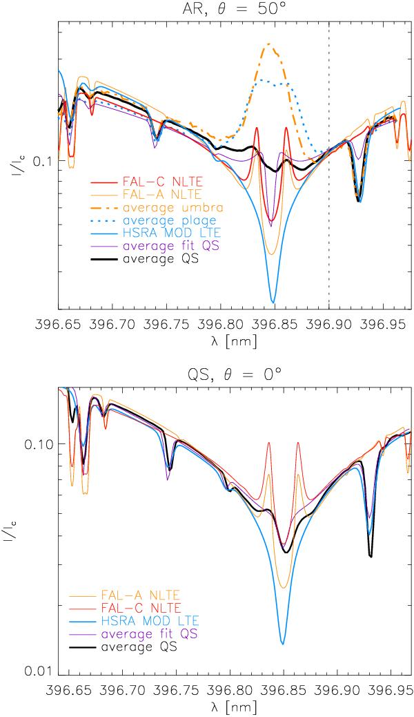
Comparison of average observed and best-fit profiles with theoretical NLTE profiles. Bottom panel: spectra from a time series in the QS on disc centre. Top panel: spectra from an AR map off centre. Thick black line: average observed QS profile. Thin purple line: average best-fit QS profile. Blue line: LTE profile of modified HSRA. Red/orange lines: NLTE FAL-C/A profile. For the AR, average profiles of a plage area (blue-dotted line) and an umbra are over-plotted (orange-dash-dotted line). The vertical dotted line denotes the wavelength of intensity normalization.
Current usage metrics show cumulative count of Article Views (full-text article views including HTML views, PDF and ePub downloads, according to the available data) and Abstracts Views on Vision4Press platform.
Data correspond to usage on the plateform after 2015. The current usage metrics is available 48-96 hours after online publication and is updated daily on week days.
Initial download of the metrics may take a while.