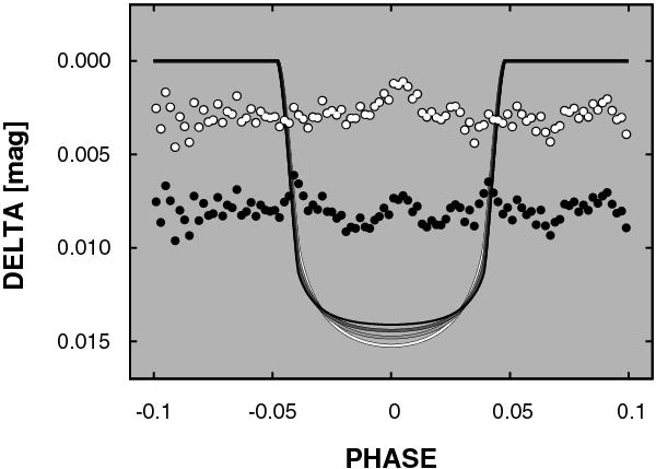
Fig. A.2

Effect of the assumed average color of the grand-averaged light curve (Fig. 10) on the transit anomaly. The continuous curves show the best fitting models from B (the deepest curve) through V, R to I (the shallowest curve). The dots represent the (shifted) residuals remaining after subtracting the model light curves corresponding to B and I (upper and lower sets of points, respectively). The “kinks” in the I residuals in the ingress/egress parts suggest that shorter wavebands give a better representation of the mixture of colors the grand-averaged light curve is assembled from.
Current usage metrics show cumulative count of Article Views (full-text article views including HTML views, PDF and ePub downloads, according to the available data) and Abstracts Views on Vision4Press platform.
Data correspond to usage on the plateform after 2015. The current usage metrics is available 48-96 hours after online publication and is updated daily on week days.
Initial download of the metrics may take a while.


