


Fig. 6
Download original image
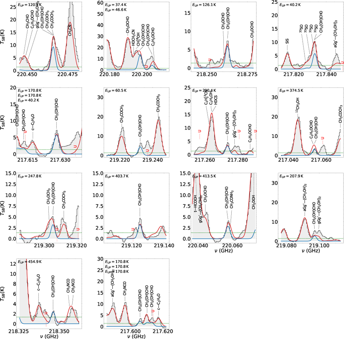
Selection of GA transitions observed and fit (see Sect. 6.1). The black histogram and its grey shadow are the observational spectrum, and the red curve is the cumulative LTE fit considering all detected species. The blue curve is the fit of the individual transitions. The horizontal dashed green line indicates the 5σ level, corresponding to ∼1.35 K. Only transitions contributing at ≥5σ are labelled. The plots are sorted by decreasing intensity of the GA transitions (blue line). The upper left corner of each panel indicates the EUP of the corresponding GA transition. When multiple GA transitions are shown in the same panel, the EUP values are listed from top to bottom following the left-to-right order of the transitions.
Current usage metrics show cumulative count of Article Views (full-text article views including HTML views, PDF and ePub downloads, according to the available data) and Abstracts Views on Vision4Press platform.
Data correspond to usage on the plateform after 2015. The current usage metrics is available 48-96 hours after online publication and is updated daily on week days.
Initial download of the metrics may take a while.