


Fig. 3.
Download original image
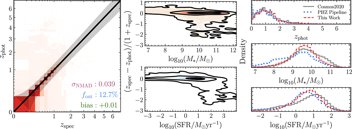
Left: Comparison between the measured photometric redshifts and a compilation of all the available and reliable spectroscopic redshifts, colour-coded by the density of objects in each bin. The black line is the 1:1 relation, while the shaded grey area is the region beyond which a prediction is considered to be an outlier. The reported metrics are NMAD (purple), the outlier fraction, fout (blue), and the bias (green), all defined in Sect. 3.1. Middle: Normalised redshift difference as a function of stellar masses (top) and SFRs (bottom). The black contours are at the same levels as in Fig. 2. Right: Normalised distributions of photometric redshifts (top), stellar masses (centre), and SFRs (bottom) for our full sample (dashed red lines), compared with the results coming from the Q1 data products (PHZ, in dotted blue lines), and COSMOS2020 (in solid grey lines), at the same magnitude cuts applied in this work (see Sect. 2).
Current usage metrics show cumulative count of Article Views (full-text article views including HTML views, PDF and ePub downloads, according to the available data) and Abstracts Views on Vision4Press platform.
Data correspond to usage on the plateform after 2015. The current usage metrics is available 48-96 hours after online publication and is updated daily on week days.
Initial download of the metrics may take a while.