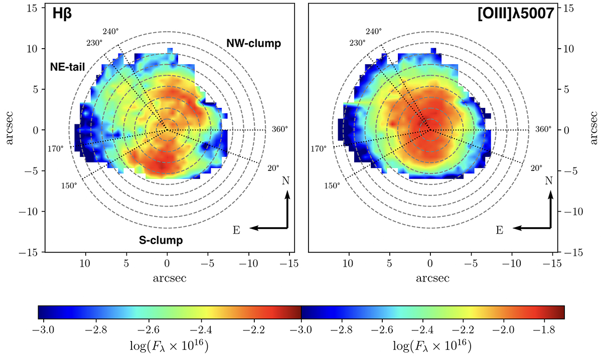
Fig. 4.
Download original image
SagDIG H II region emission line maps. The left panel shows the Hβ emission line distribution. The right panel shows the [O III]λ5007 emission line distribution. The colour map represents the flux at each emission line. The dashed grey lines indicate circles of increasing radius of 1.34″ (2 px) up to 12.06″ (18 px). The dotted black lines show the angles that separate the S clump, the NE tail, and the NW clump.
Current usage metrics show cumulative count of Article Views (full-text article views including HTML views, PDF and ePub downloads, according to the available data) and Abstracts Views on Vision4Press platform.
Data correspond to usage on the plateform after 2015. The current usage metrics is available 48-96 hours after online publication and is updated daily on week days.
Initial download of the metrics may take a while.