Fig. 8
Download original image
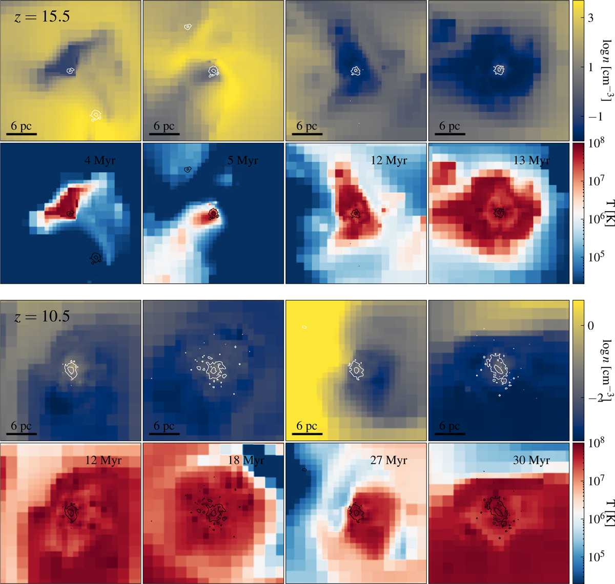
Top panels: slice of gas density passing through the center of four selected clumps (first row). Darker colors indicate regions of higher density, while lighter colors correspond to lower density areas. The second row displays the corresponding temperature maps. Superimposed on each map are curves of constant projected stellar density, shown as white lines (top) and black lines (bottom). All clumps in the first row are observed at redshift z = 15.5. Bottom panels: same as the top panels, but for four clumps at z = 10.5. In the top right part of each panel, we have indicated the age of the clump.
Current usage metrics show cumulative count of Article Views (full-text article views including HTML views, PDF and ePub downloads, according to the available data) and Abstracts Views on Vision4Press platform.
Data correspond to usage on the plateform after 2015. The current usage metrics is available 48-96 hours after online publication and is updated daily on week days.
Initial download of the metrics may take a while.