Fig. 12.
Download original image
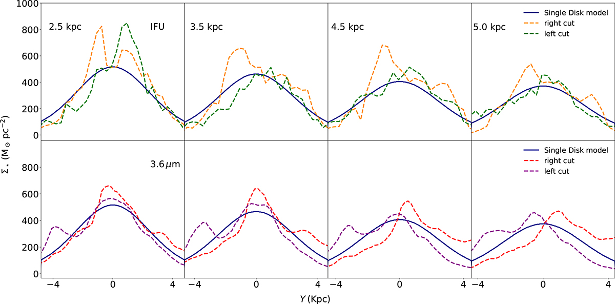
Comparison of cut profiles along the y-axis of the surface density distribution in the stellar disk of NGC 551. In the top panels, we compare the IFU observation with the simulation, whereas in the bottom panels, we compare Spitzer 3.6 μm with the simulation. Each column of panels shows different radii. In each panel, the solid lines denote the profiles for simulated maps, whereas the dashed lines show the observed ones. Two different colors represent two different halves (left and right) of the observed map as shown in Fig. 11. The simulated profiles at different radii match the observation reasonably well. See the text for more details.
Current usage metrics show cumulative count of Article Views (full-text article views including HTML views, PDF and ePub downloads, according to the available data) and Abstracts Views on Vision4Press platform.
Data correspond to usage on the plateform after 2015. The current usage metrics is available 48-96 hours after online publication and is updated daily on week days.
Initial download of the metrics may take a while.