Fig. 11.
Download original image
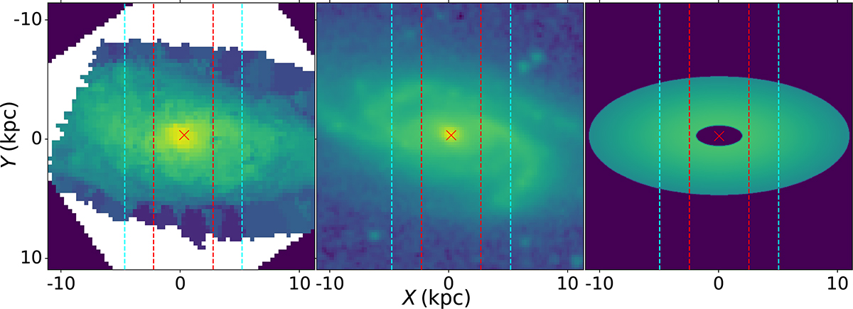
Cuts along the y-axis at radii of 2.5 and 5.0 kpc (dashed red and cyan lines) for comparison between the observations and the simulation. The left panel represents the surface brightness map of the stellar disk, as obtained by IFU observation. The middle panel shows the stellar disk as observed in Spitzer 3.6 μm data. The right panel indicates our simulated intensity distribution. The crosses in each panel indicate the center of the galaxy.
Current usage metrics show cumulative count of Article Views (full-text article views including HTML views, PDF and ePub downloads, according to the available data) and Abstracts Views on Vision4Press platform.
Data correspond to usage on the plateform after 2015. The current usage metrics is available 48-96 hours after online publication and is updated daily on week days.
Initial download of the metrics may take a while.