Fig. 9.
Download original image
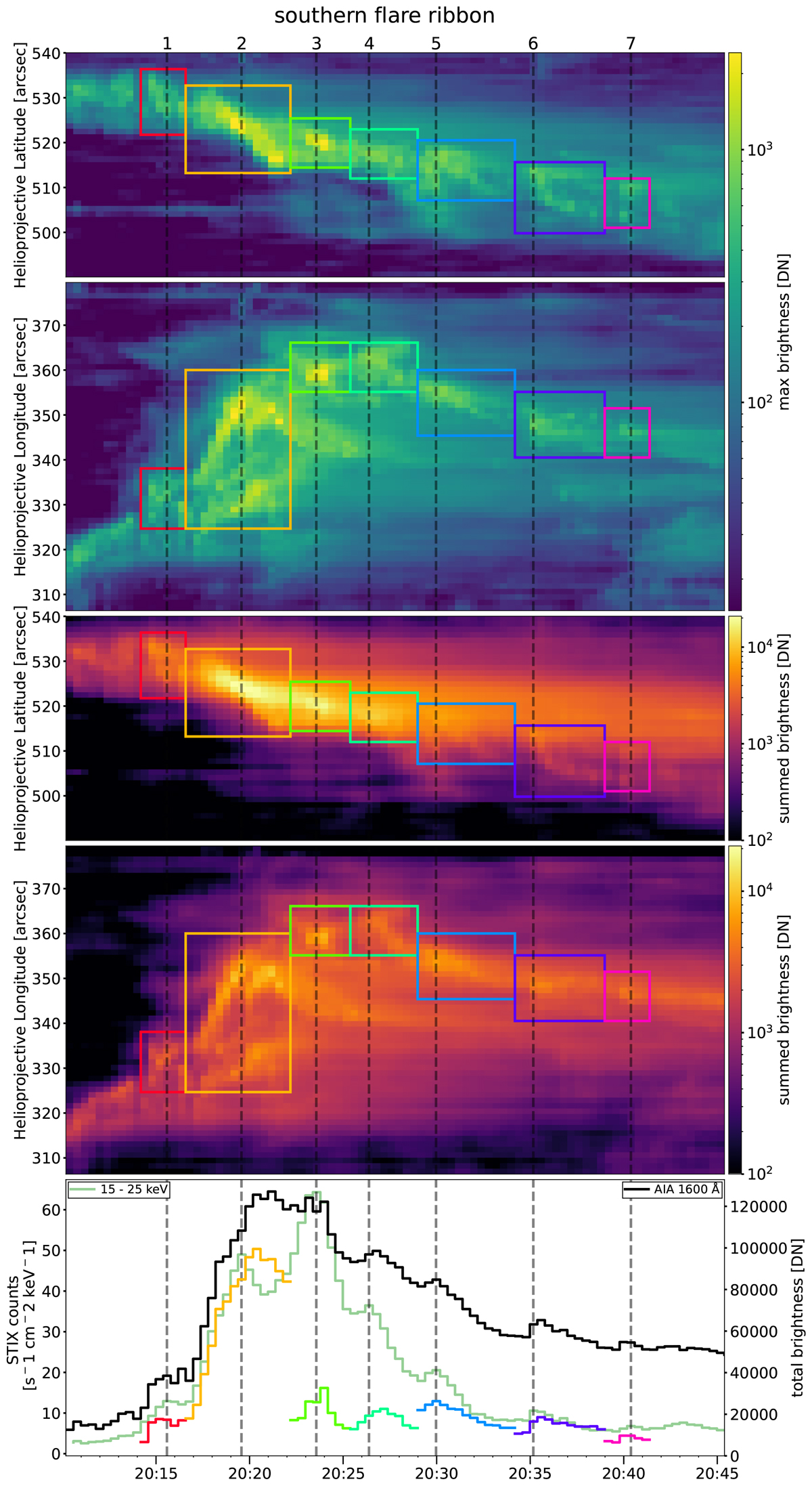
Time-distance plots of the maximum/summed pixel values along rows/columns of a AIA 1600 Å base difference image sequence of the southern flare ribbon. Upper panel: The maximum pixel values along each row as a function of time. Colored boxes indicate the extent and duration of masks placed around each peak. Second panel: Same, but for the maxima along each column. Third panel: The sum of pixel values along each row. Fourth panel: Sum along the columns of the image. Bottom panel: Time series of the total AIA 1600 Å counts in the entire subarea (black). Colored time series correspond to the counts within the matching masks drawn on the time-distance plots above. The STIX 10–15 keV light curve (green) is plotted for comparison, and HXR peaks are marked with dashed lines throughout this plot and marked at the top of the figure. The associated movie visualizes how the time-distance plots of the maximum values are obtained and how their evolution relates to the images. Associated movie is available online.
Current usage metrics show cumulative count of Article Views (full-text article views including HTML views, PDF and ePub downloads, according to the available data) and Abstracts Views on Vision4Press platform.
Data correspond to usage on the plateform after 2015. The current usage metrics is available 48-96 hours after online publication and is updated daily on week days.
Initial download of the metrics may take a while.