Fig. 4.
Download original image
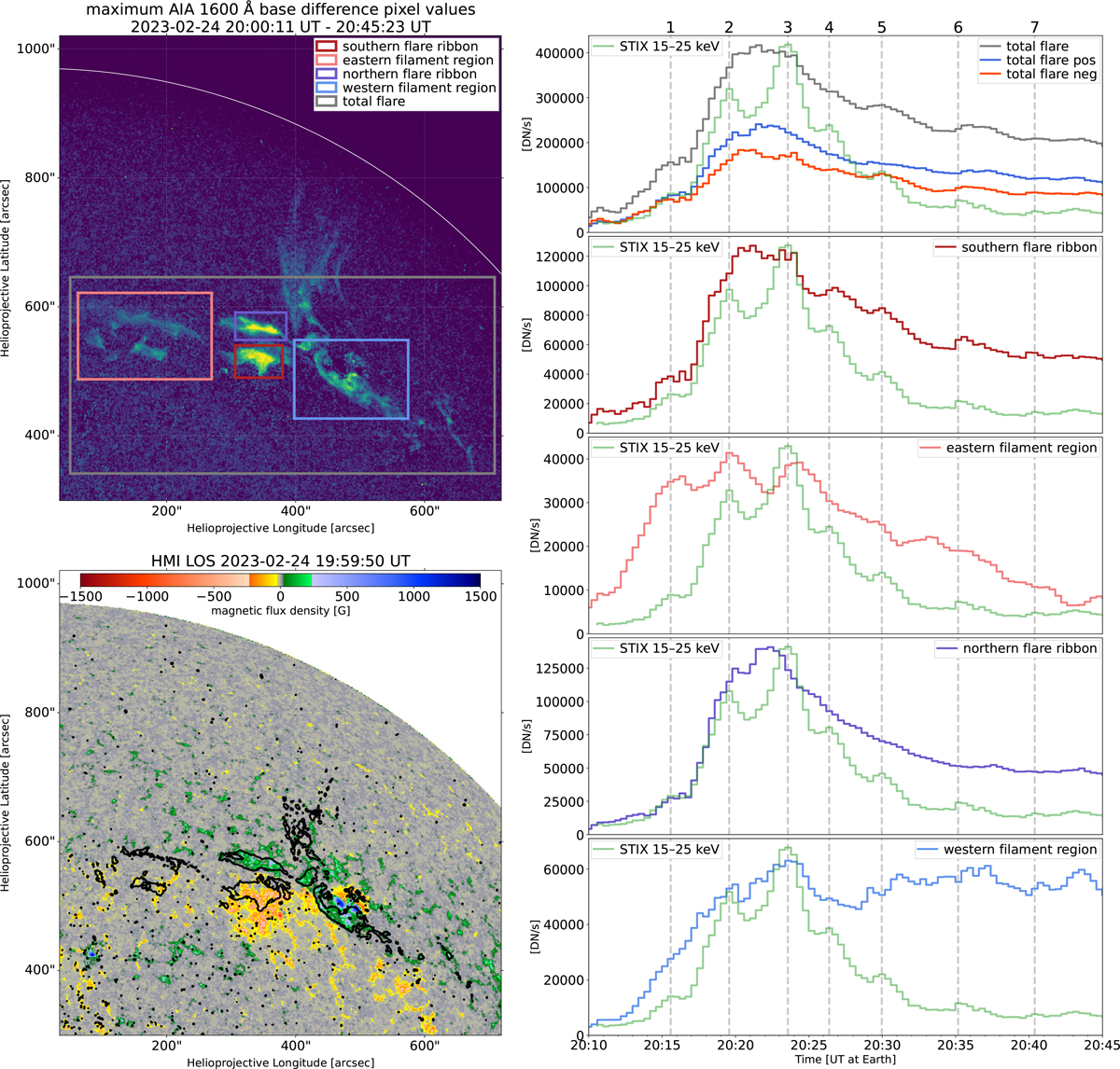
Overview of AIA 1600 Å base difference light curves in different subregions. Top left: Map showing the maximum pixel values in AIA 1600 Å base difference maps during the given time interval with four subregions marked. Bottom left: HMI LOS magnetogram with contours (25 DN/s) of the maximum AIA 1600 Å brightness map above. Right: Light curves showing the time evolution of the total AIA 1600 Å base difference counts in each of the marked subregions. The emission in the total flare mask shown in the top panel is further divided into emission from pixels corresponding to a positive or negative polarity region, as derived from the shown HMI LOS magnetogram. The STIX 15–25 keV light curve (green) is shown as a reference, and peak times of the HXR pulsations are marked by dashed lines and numbered at the top.
Current usage metrics show cumulative count of Article Views (full-text article views including HTML views, PDF and ePub downloads, according to the available data) and Abstracts Views on Vision4Press platform.
Data correspond to usage on the plateform after 2015. The current usage metrics is available 48-96 hours after online publication and is updated daily on week days.
Initial download of the metrics may take a while.