Fig. 9
Download original image
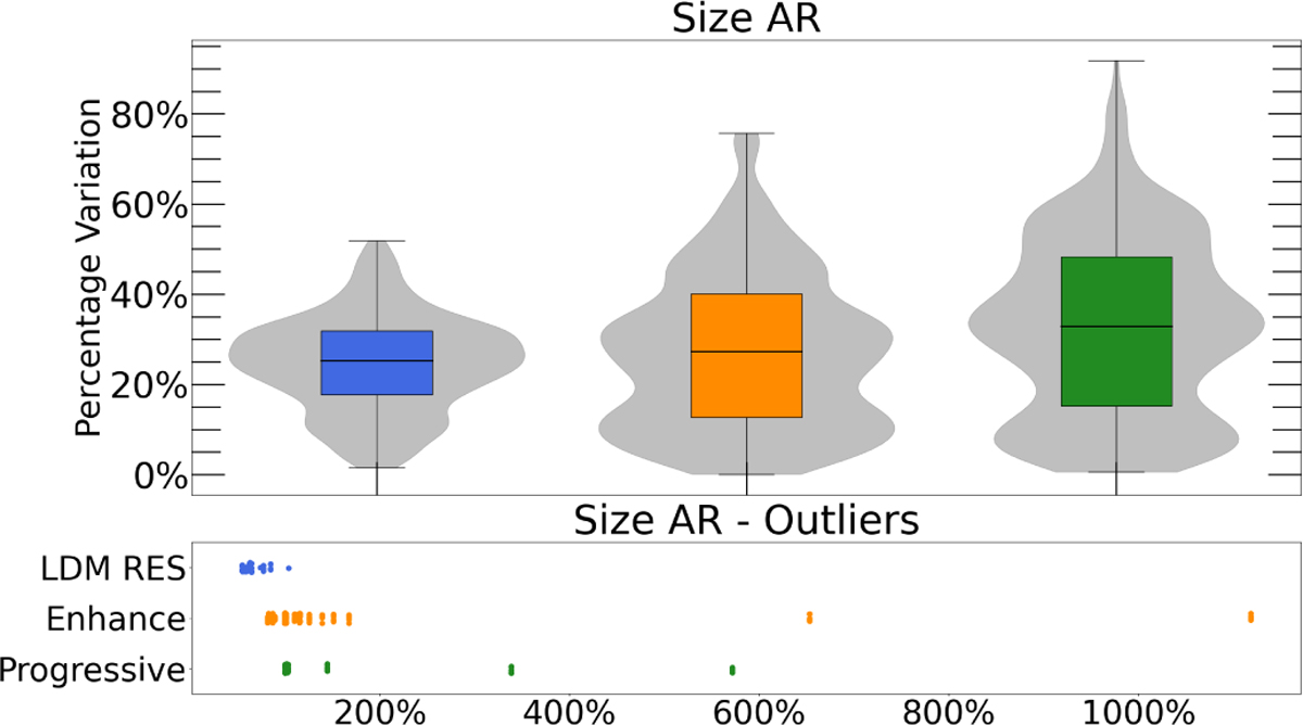
Image showing the boxplot of the active region size metric, whose mean and standard deviation are presented in Table 2. The main plot displays the data distribution between the 25th and 75th percentiles, while the subplot highlights all outliers outside this range. The boxplot is included because, although the mean values in Table 2 are acceptable, the wide confidence intervals make it easier to visually assess the model’s quality.
Current usage metrics show cumulative count of Article Views (full-text article views including HTML views, PDF and ePub downloads, according to the available data) and Abstracts Views on Vision4Press platform.
Data correspond to usage on the plateform after 2015. The current usage metrics is available 48-96 hours after online publication and is updated daily on week days.
Initial download of the metrics may take a while.