Fig. 1.
Download original image
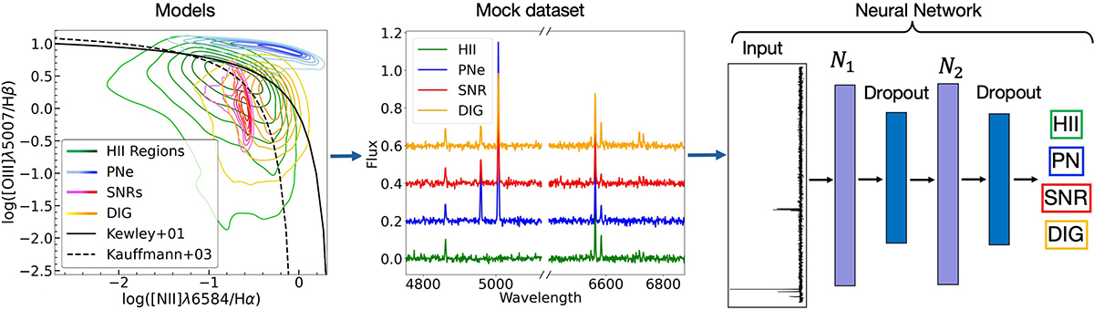
Schematic representation of the workflow presented in this paper. The diagram illustrates the key steps and processes involved in the analysis, from choosing the emission-line region models to the generation of the simulated dataset of spectra and the neural network’s classification. The leftmost image illustrates the model selection phase, depicting the distribution of our H II region, PN, SNR, and DIG models on a BPT diagnostic diagram (Baldwin et al. 1981). The central plot provides a representative simulated spectrum for each of the four classes. The rightmost panel presents a schematic of the neural network architecture, where the simulated spectra serve as input, and the network is trained to classify each spectrum into its corresponding nebular type.
Current usage metrics show cumulative count of Article Views (full-text article views including HTML views, PDF and ePub downloads, according to the available data) and Abstracts Views on Vision4Press platform.
Data correspond to usage on the plateform after 2015. The current usage metrics is available 48-96 hours after online publication and is updated daily on week days.
Initial download of the metrics may take a while.