Fig. 13
Download original image
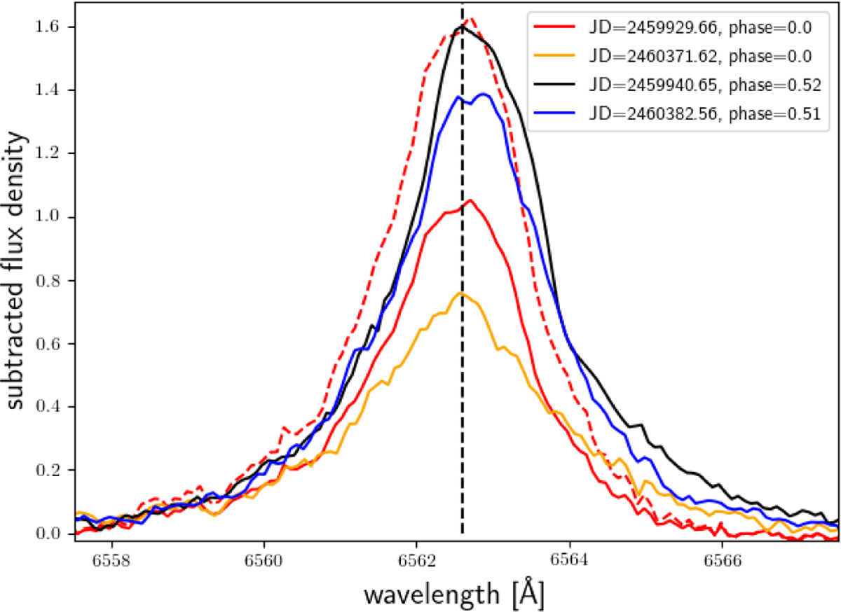
Long time line evolution of H α. We compare here the two spectra with the highest red and blue shift respectively from Figs. 11 and 12. The black and blue lines denote the spectra of phase 0.5 from the first and second season, respectively. The red and orange lines denote the spectra of phase 0. for the first and second season, respectively. Each spectrum has a PHOENIX photospheric model subtracted. We show additionally the red spectrum scaled to match the black spectrum as red dashed line. The dashed vertical black line marks line centre.
Current usage metrics show cumulative count of Article Views (full-text article views including HTML views, PDF and ePub downloads, according to the available data) and Abstracts Views on Vision4Press platform.
Data correspond to usage on the plateform after 2015. The current usage metrics is available 48-96 hours after online publication and is updated daily on week days.
Initial download of the metrics may take a while.