Fig. 2.
Download original image
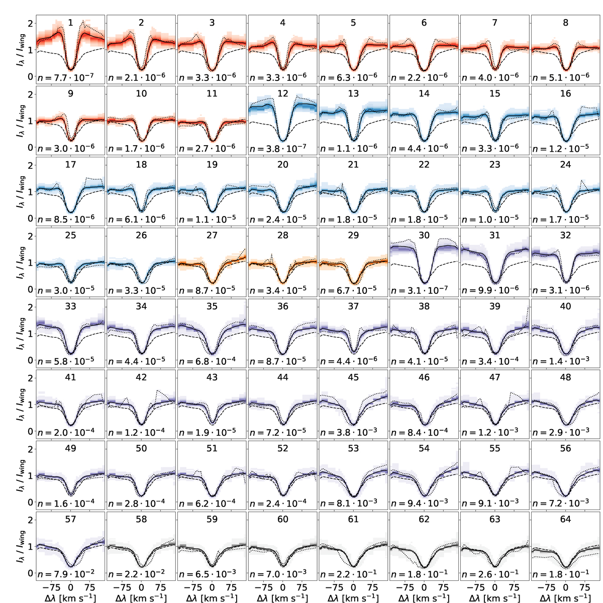
Overview of all the clusters from our k-means model. The solid lines represent the cluster centres of the respective clusters. The shaded areas represent the spectral line density within each cluster, where a stronger colour means a higher density; red and blue represent QSEBs, where the cluster centres in the red group have ![]() in both wings, while the cluster centres in the blue group have
in both wings, while the cluster centres in the blue group have ![]() in only the blue wing; orange represents clusters containing both QSEB and non-QSEB profiles; purple represents clusters with MCs; grey represents clusters with neither QSEBs nor MCs; the dotted line is the spectral profile that deviates the most from its cluster centre; the dashed line is the background profile, which is the average profile over the entire dataset and serves as a reference; n represents the fraction of pixels from the entire dataset (N = 685 ⋅ 106 pixels) within the respective cluster centre. Iwing is the average intensity of the second to outermost wavelength points in the blue and red wing (we did not choose the outermost wavelength points to avoid blends).
in only the blue wing; orange represents clusters containing both QSEB and non-QSEB profiles; purple represents clusters with MCs; grey represents clusters with neither QSEBs nor MCs; the dotted line is the spectral profile that deviates the most from its cluster centre; the dashed line is the background profile, which is the average profile over the entire dataset and serves as a reference; n represents the fraction of pixels from the entire dataset (N = 685 ⋅ 106 pixels) within the respective cluster centre. Iwing is the average intensity of the second to outermost wavelength points in the blue and red wing (we did not choose the outermost wavelength points to avoid blends).
Current usage metrics show cumulative count of Article Views (full-text article views including HTML views, PDF and ePub downloads, according to the available data) and Abstracts Views on Vision4Press platform.
Data correspond to usage on the plateform after 2015. The current usage metrics is available 48-96 hours after online publication and is updated daily on week days.
Initial download of the metrics may take a while.