Fig. 2.
Download original image
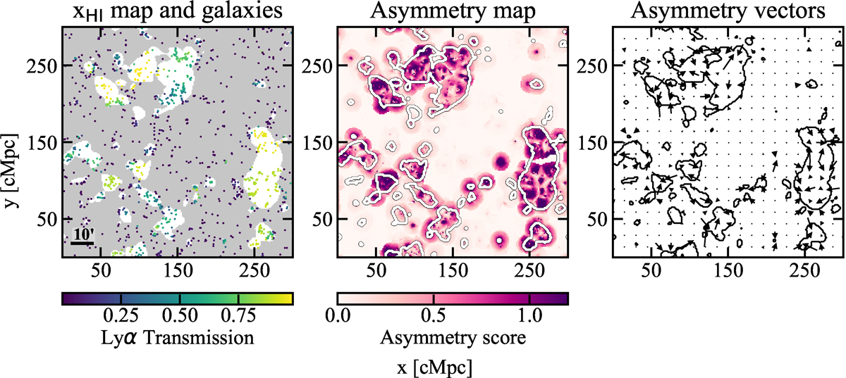
Example of an asymmetry score map made using galaxies’ Lyα transmission. Left: Simulated ionization map (4 cMpc slice from our simulation with mean neutral fraction ![]() ) and galaxies used to calculate asymmetry score. White regions are ionized, gray are neutral. The galaxies are color-coded by their modeled Lyα transmission, where we see galaxies with highest transmission are in the centers of bubbles. In the lower left corner we display a 10′ ruler (at z = 8) for gauging bubble size in angular scale. Middle: Asymmetry score map (red map). We plot the input ionization map (white contours) on top of the map. As expected, bubble edges have higher asymmetry score. Right: Asymmetry vector map where we see asymmetry vectors, color-coded by asymmetry score, point toward bubble edges, black contours mark the input ionization map.
) and galaxies used to calculate asymmetry score. White regions are ionized, gray are neutral. The galaxies are color-coded by their modeled Lyα transmission, where we see galaxies with highest transmission are in the centers of bubbles. In the lower left corner we display a 10′ ruler (at z = 8) for gauging bubble size in angular scale. Middle: Asymmetry score map (red map). We plot the input ionization map (white contours) on top of the map. As expected, bubble edges have higher asymmetry score. Right: Asymmetry vector map where we see asymmetry vectors, color-coded by asymmetry score, point toward bubble edges, black contours mark the input ionization map.
Current usage metrics show cumulative count of Article Views (full-text article views including HTML views, PDF and ePub downloads, according to the available data) and Abstracts Views on Vision4Press platform.
Data correspond to usage on the plateform after 2015. The current usage metrics is available 48-96 hours after online publication and is updated daily on week days.
Initial download of the metrics may take a while.