Fig. 3.
Download original image
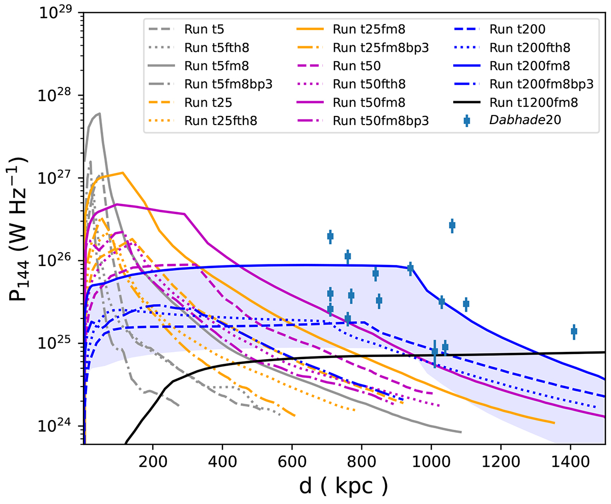
Evolution of the simulated radio sources in the P-D diagram. Distinct colors represent different powers, while different line styles signify distinct fractions of energy components and the magnetic structure parameter, αp. The blue shade covers regions with radio power one order of magnitude lower than that indicated by the solid blue line. The detailed methodology for calculating radio power is described in Appendix C. The data points utilized in this analysis are sourced from Dabhade et al. (2020b).
Current usage metrics show cumulative count of Article Views (full-text article views including HTML views, PDF and ePub downloads, according to the available data) and Abstracts Views on Vision4Press platform.
Data correspond to usage on the plateform after 2015. The current usage metrics is available 48-96 hours after online publication and is updated daily on week days.
Initial download of the metrics may take a while.