Fig. B.2
Download original image
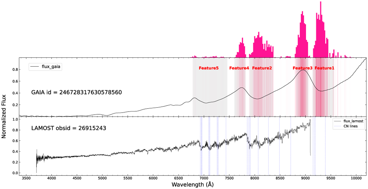
Example comparison of Gaia/LAMOST where the model explains the distribution of the most critical features (light gray areas) in the Gaia spectrum. The red gradient against a light gray background and the deep pink energy bar at the upper panel indicate the intensity of the feature SHAP values. The corresponding CN molecular absorption line positions (light blue dotted lines) are plotted in the LAMOST spectrum.
Current usage metrics show cumulative count of Article Views (full-text article views including HTML views, PDF and ePub downloads, according to the available data) and Abstracts Views on Vision4Press platform.
Data correspond to usage on the plateform after 2015. The current usage metrics is available 48-96 hours after online publication and is updated daily on week days.
Initial download of the metrics may take a while.