Fig. 7
Download original image
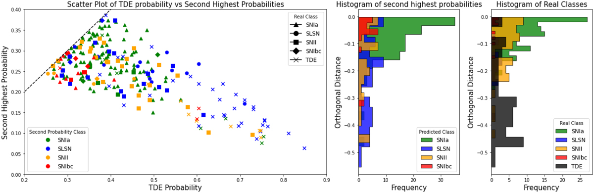
Scatter plot of the sources predicted as TDEs in the labeled set. The x-axis represents the predicted probability of being a TDE, while the y-axis shows the second-highest probability. The dashed gray line represents a 1:1 ratio, where points closer to this line indicate greater uncertainty by the classifier regarding the true class of the source. The middle plot shows the second most probable class labels, while the right plot presents the true class labels of the sources. These histogram plots depict the orthogonal distances of the sources from the dashed line, providing insight into the classifier’s confusion relative to the real classes of the sources.
Current usage metrics show cumulative count of Article Views (full-text article views including HTML views, PDF and ePub downloads, according to the available data) and Abstracts Views on Vision4Press platform.
Data correspond to usage on the plateform after 2015. The current usage metrics is available 48-96 hours after online publication and is updated daily on week days.
Initial download of the metrics may take a while.