Fig. 11.
Download original image
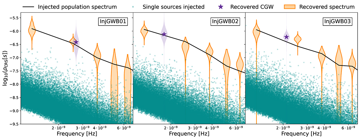
Injected and recovered signals in the three injGWB datasets. In each panel, the green stars represent the contributions of each binary of the injected population to the GWB, the black line is the total power spectral density per frequency bin. The orange violin plot is the HD-correlated free spectrum recovery and the purple violin is the posterior distribution of the recovered CGW amplitude at the location of the recovered CGW frequency.
Current usage metrics show cumulative count of Article Views (full-text article views including HTML views, PDF and ePub downloads, according to the available data) and Abstracts Views on Vision4Press platform.
Data correspond to usage on the plateform after 2015. The current usage metrics is available 48-96 hours after online publication and is updated daily on week days.
Initial download of the metrics may take a while.