Fig. 2.
Download original image
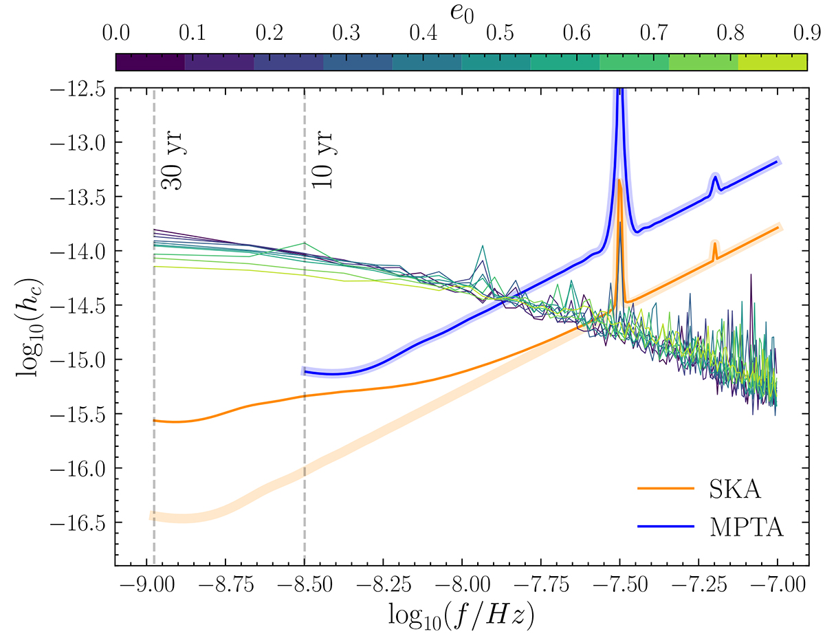
Sensitivity curves of 10-year MPTA (blue) and 30-year SKA (orange) computed from HASASIA. The vertical dashed lines correspond to the frequency associated with the observing time span of MPTA and SKA (highlighted with vertical dashed lines). For completeness, the square mean of sGWB produced by our MBHB populations at different e0 models are represented in different colors. Pale (dark) blue and orange lines correspond to the MPTA and SKA sensitivity curves when accounting for pulsar white noise only (white plus red noise).
Current usage metrics show cumulative count of Article Views (full-text article views including HTML views, PDF and ePub downloads, according to the available data) and Abstracts Views on Vision4Press platform.
Data correspond to usage on the plateform after 2015. The current usage metrics is available 48-96 hours after online publication and is updated daily on week days.
Initial download of the metrics may take a while.