Fig. 8
Download original image
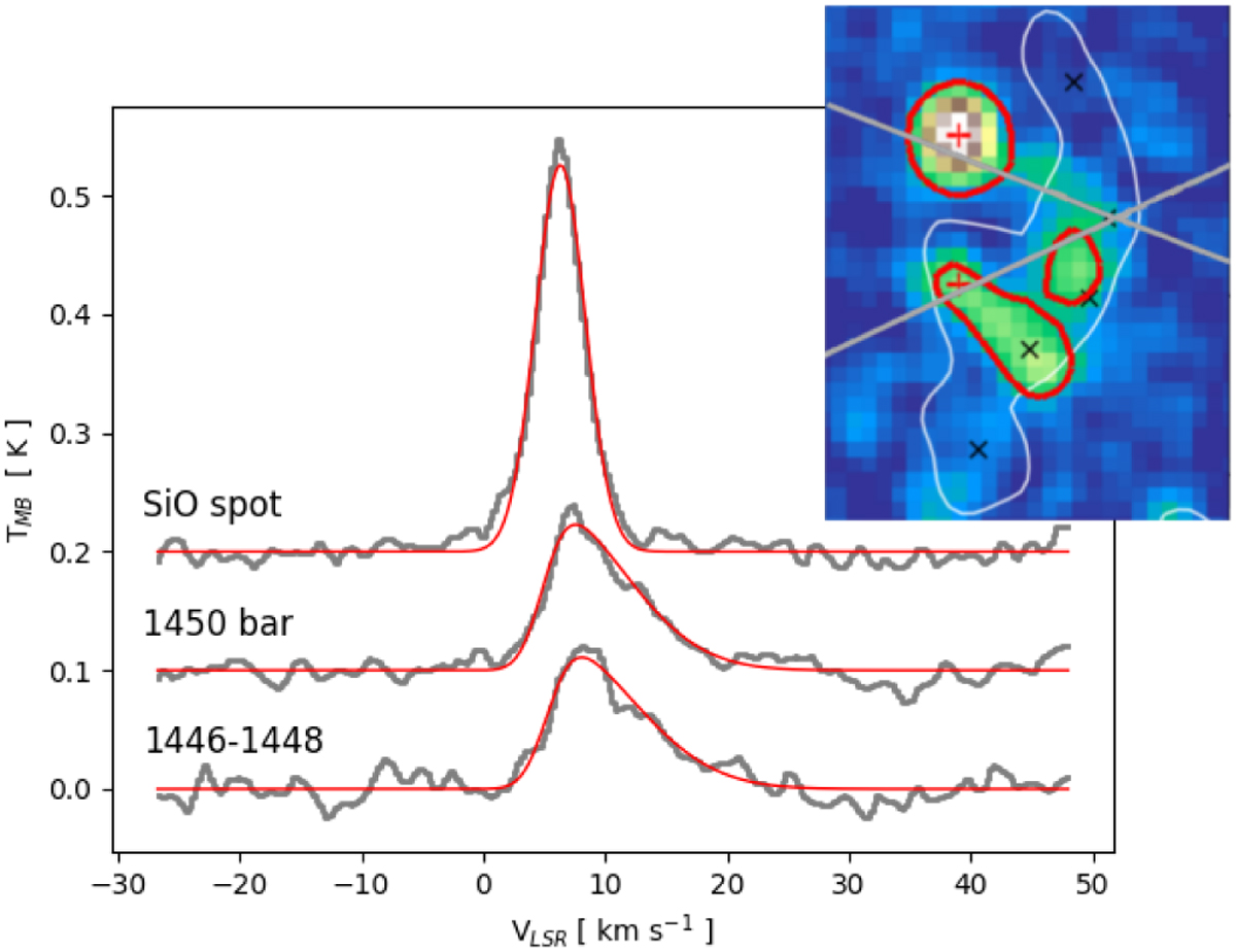
SiO (2–1) spectra for the three main SiO bright regions (thick grey lines). The red lines show the Gaussian best fit for the SiO spot region, and the skew normal distribution best fit for the other two regions. The insert reproduces the integrated intensity map of SiO shown in Fig. 2. Red contours were added to show the regions where the SiO spectra were considered (SiO spot, 1446–1448, and 1450 bar, from north to south). The grey lines represent the outflow directions from 1446 according to Paper II (their Fig. 12).
Current usage metrics show cumulative count of Article Views (full-text article views including HTML views, PDF and ePub downloads, according to the available data) and Abstracts Views on Vision4Press platform.
Data correspond to usage on the plateform after 2015. The current usage metrics is available 48-96 hours after online publication and is updated daily on week days.
Initial download of the metrics may take a while.