Fig. 7.
Download original image
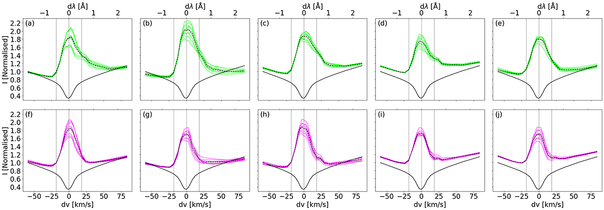
Spectral profiles in the Ca II 8542 Å channel along the flare ribbon. The upper row shows profiles from blob locations in green and the bottom row shows profiles from regions between the blobs in magenta. Positive (negative) dν corresponds to red-shifts (blue-shifts). Each panel is colour-coded and given a title in accordance with the pixels in Fig. 4 and presents a 3 × 3-grid of adjacent pixels. In every panel, the solid coloured lines represent observed spectral profiles, the black dashed line represents the average, and the black solid line is the average profile over a QS region from the same timestep. All profiles are normalised by the blue wing of the QS average profile. The middle black vertical line highlights the core positions, while the left and right vertical lines show the wavelength positions used to create the Doppler map in Fig. 4c.
Current usage metrics show cumulative count of Article Views (full-text article views including HTML views, PDF and ePub downloads, according to the available data) and Abstracts Views on Vision4Press platform.
Data correspond to usage on the plateform after 2015. The current usage metrics is available 48-96 hours after online publication and is updated daily on week days.
Initial download of the metrics may take a while.