Fig. 8.
Download original image
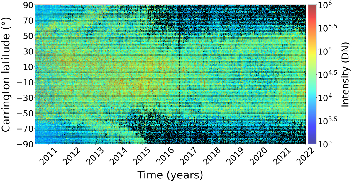
Latitude and intensity of coronal off-limb structures as a function of time. The intensity of the coronal structures in digital number (DN) is represented using a gradual colour-code based on a logarithmic scale, with blue indicating the lowest-intensity structures and red indicating the highest. The distribution of structures per latitude over time clearly illustrates the butterfly diagram (particularly when looking at the highest-intensity reddish structures), with coronal activity moving toward the equator as SC 24 progresses. It also shows the notable rush-to-the-poles phenomenon observed in both hemispheres between 2010 and 2015, with several surges in the northern hemisphere.
Current usage metrics show cumulative count of Article Views (full-text article views including HTML views, PDF and ePub downloads, according to the available data) and Abstracts Views on Vision4Press platform.
Data correspond to usage on the plateform after 2015. The current usage metrics is available 48-96 hours after online publication and is updated daily on week days.
Initial download of the metrics may take a while.