Fig. 6.
Download original image
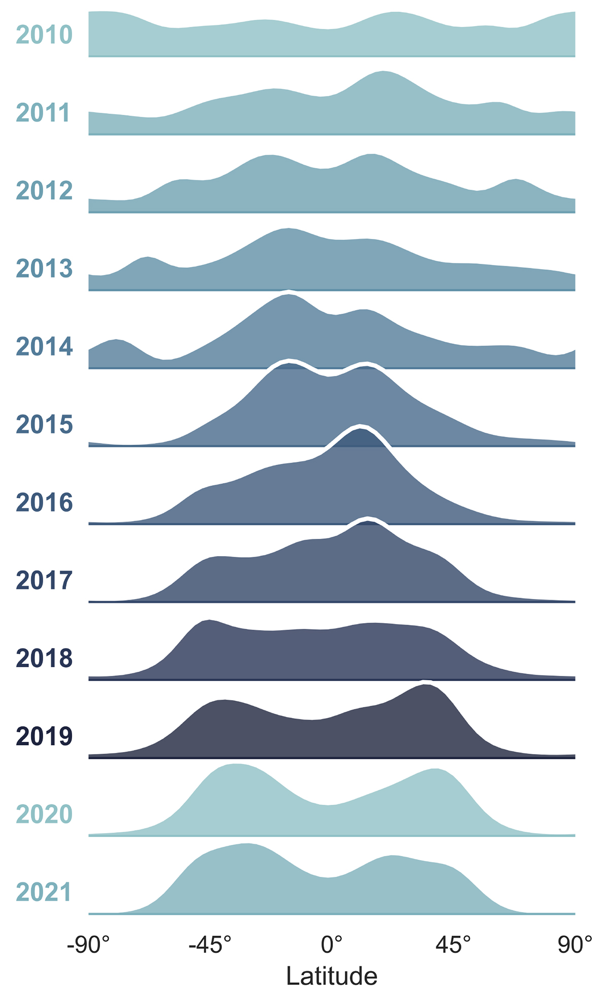
Distribution of the latitude of coronal off-limb structures per year. Row 1 corresponds to 2010 and row 12 to 2021. Only six months of data were recorded in 2010, while the other rows represent entire years. This figure is consistent with the butterfly diagram, illustrating two distinct latitudinal peaks in the northern and southern hemispheres for most years. These peaks shift over time, moving closer to each other and toward the equator around the maximum of SC 24 in 2014 and at the beginning of the declining phase. Eventually, they converge into a single peak near the equator (slightly to the northern side). At the end of SC 24 and the beginning of SC 25, the peaks appear distinctly apart as coronal activity increases at mid-latitudes.
Current usage metrics show cumulative count of Article Views (full-text article views including HTML views, PDF and ePub downloads, according to the available data) and Abstracts Views on Vision4Press platform.
Data correspond to usage on the plateform after 2015. The current usage metrics is available 48-96 hours after online publication and is updated daily on week days.
Initial download of the metrics may take a while.