Fig. 2.
Download original image
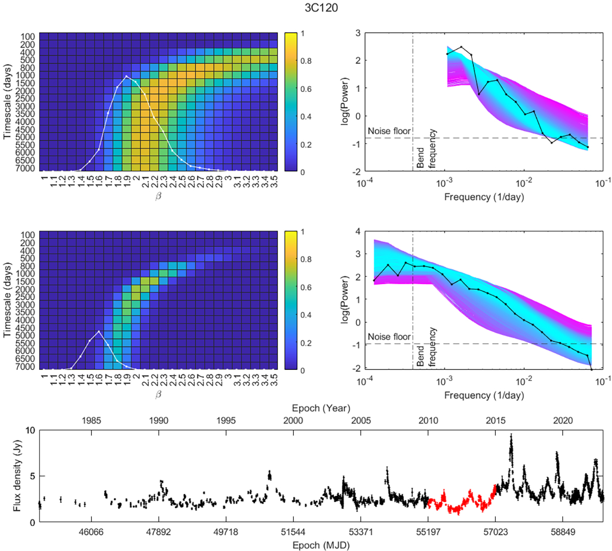
Comparison between the results for source 3C120, when using a shorter segment of data and the entire monitoring period. The first row of plots uses data between 2010 and 2015, and the middle row uses the entire light curve shown in bottom row, where the red portion corresponds to the five-year segment. The upper left-side heat map shows the PSRESP fits for each bending power-law parameter combination using five years of data. The white graph overlaid with the heat map shows the simple power-law fit with the x-axis being equivalent to the heat map x-axis. The y-axis for the white graph equals the heat map legend range scaled to agree with the label positions. The right-side plot shows the source periodogram (black) and each simulated mean periodogram with cyan indicating the best fit and magenta the worst fit. The heat map and PSD graph below show the equivalent results using the entire light curve of 3C120 shown on the bottom row. The dotted vertical lines on both periodogram graphs show the best-fit bend frequency obtained by using the entire light curve, and the dashed horizontal lines show the noise floor.
Current usage metrics show cumulative count of Article Views (full-text article views including HTML views, PDF and ePub downloads, according to the available data) and Abstracts Views on Vision4Press platform.
Data correspond to usage on the plateform after 2015. The current usage metrics is available 48-96 hours after online publication and is updated daily on week days.
Initial download of the metrics may take a while.