Fig. A.9.
Download original image
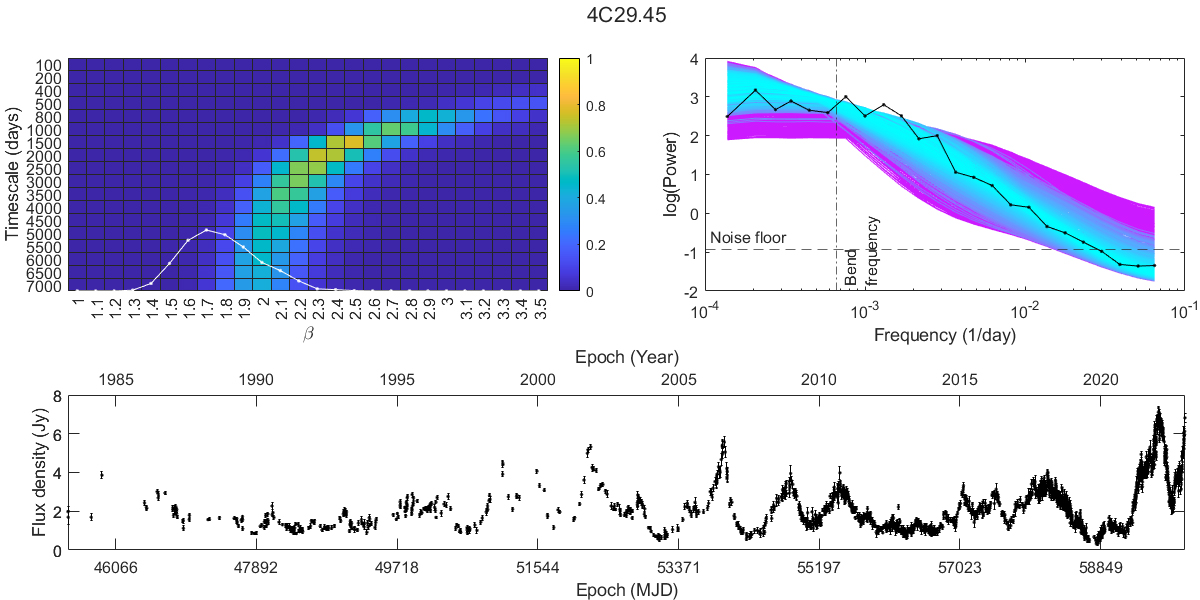
Results from the periodogram analysis of source 4C29.45. The upper left-side plot shows the heat map overlaid with the simple power-law fit in white. The plot on its right is the periodogram of the source including all of the mean periodograms of the simulated bending power laws with cyan indicating the best fit and magenta the worst. The bottom row shows the source light curve.
Current usage metrics show cumulative count of Article Views (full-text article views including HTML views, PDF and ePub downloads, according to the available data) and Abstracts Views on Vision4Press platform.
Data correspond to usage on the plateform after 2015. The current usage metrics is available 48-96 hours after online publication and is updated daily on week days.
Initial download of the metrics may take a while.