Fig. 3.
Download original image
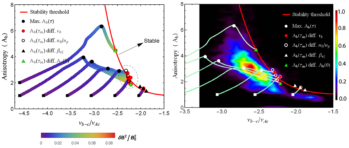
Comparison between QL theory and PSP observations. Left: QL dynamical paths of the temperature anisotropy (Ab) vs. beam-core drift velocity (vb − c/vAc). The black squares are the initial states, and the magnetic wave energy level is color-coded. The final states after saturation gather on the red curve (see text): red (large) dots for runs 1–3 and 13–15, circles for runs 4–6, black triangles for runs 7–9, and green triangles for runs 10–12. Right: Same as the left panel (black symbols are now shown as white symbols), but superimposed on PSP observations. The (normalized) number of events with hammerhead populations are color-coded (adapted from Figure 2, panel (b), in Verniero et al. (2022) ©AAS).
Current usage metrics show cumulative count of Article Views (full-text article views including HTML views, PDF and ePub downloads, according to the available data) and Abstracts Views on Vision4Press platform.
Data correspond to usage on the plateform after 2015. The current usage metrics is available 48-96 hours after online publication and is updated daily on week days.
Initial download of the metrics may take a while.