Fig. C.3.
Download original image
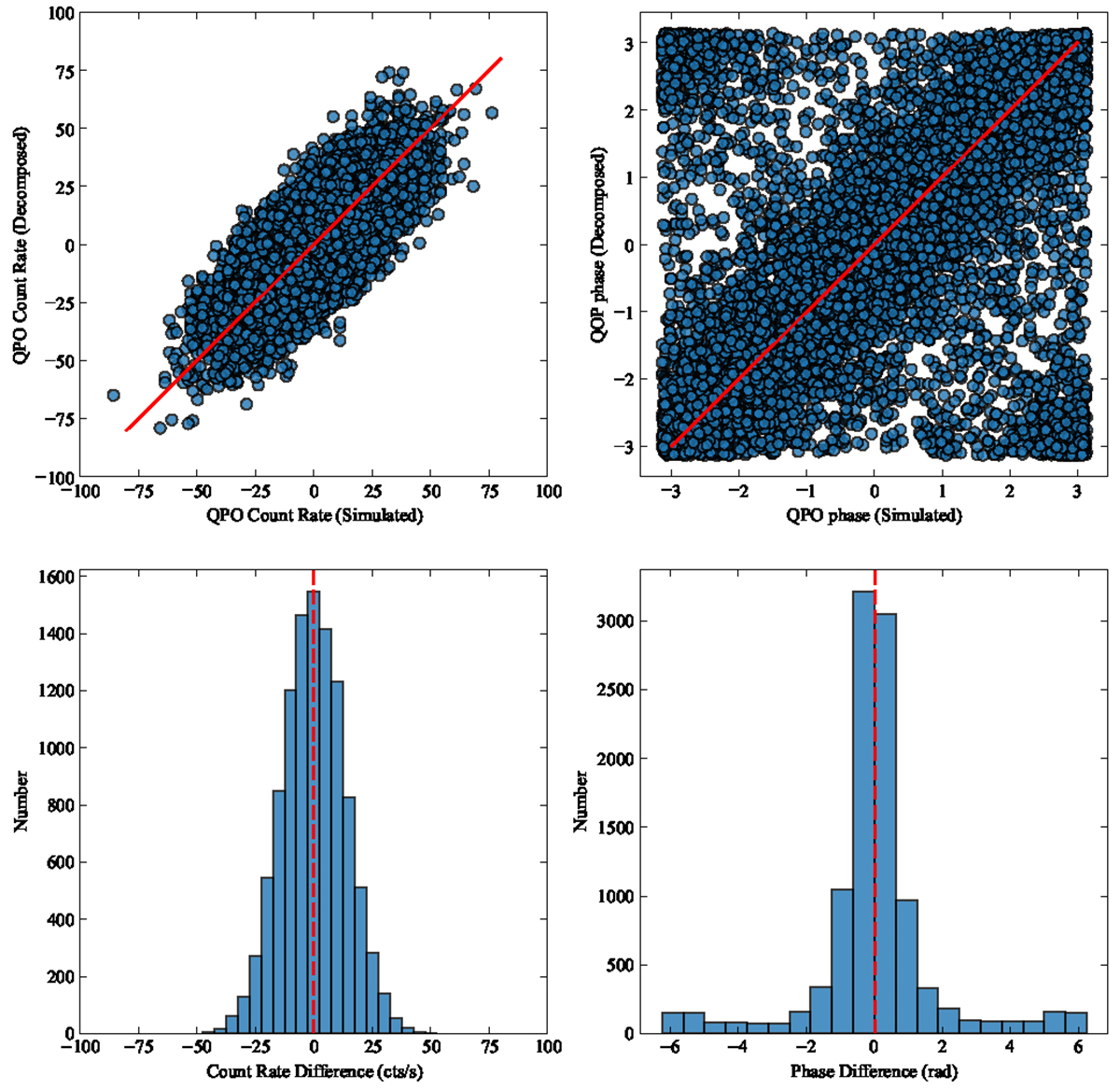
Comparison between simulated and decomposed QPO signals. Top panels: Correlations between the simulated results and decomposed results, including the QPO count rate and QPO phases. Bottom panels: Histograms of the count rate difference and phase difference between the simulated QPO and decomposed QPO signals. The dashed red lines in both the top and bottom panels represent the case where the two signals are in perfect alignment.
Current usage metrics show cumulative count of Article Views (full-text article views including HTML views, PDF and ePub downloads, according to the available data) and Abstracts Views on Vision4Press platform.
Data correspond to usage on the plateform after 2015. The current usage metrics is available 48-96 hours after online publication and is updated daily on week days.
Initial download of the metrics may take a while.