Fig. 5.
Download original image
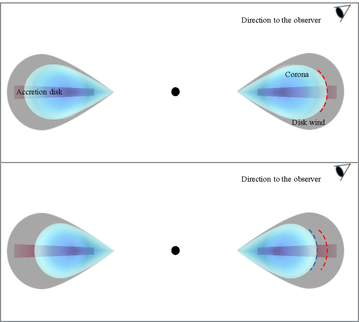
Simplified schematic diagram of the transformation from the corona (blue area) to the wind (gray area) during the QPO phases. We show the change in a region of gas with a hot electron above the disk, referred to as the corona, in response to QPO phases. The diagram shows that the variation in the corona is anticorrelated with the ejection of ionized material through the disk wind during different QPO phases. The top and bottom panels show the situations of the QPO peak at 0.5−0.6 phase and the QPO trough at 0.0−0.1 phase. The dashed red and blue lines indicate the corona size at the highest and lowest points of the QPO phase, respectively.
Current usage metrics show cumulative count of Article Views (full-text article views including HTML views, PDF and ePub downloads, according to the available data) and Abstracts Views on Vision4Press platform.
Data correspond to usage on the plateform after 2015. The current usage metrics is available 48-96 hours after online publication and is updated daily on week days.
Initial download of the metrics may take a while.