Fig. 3.
Download original image
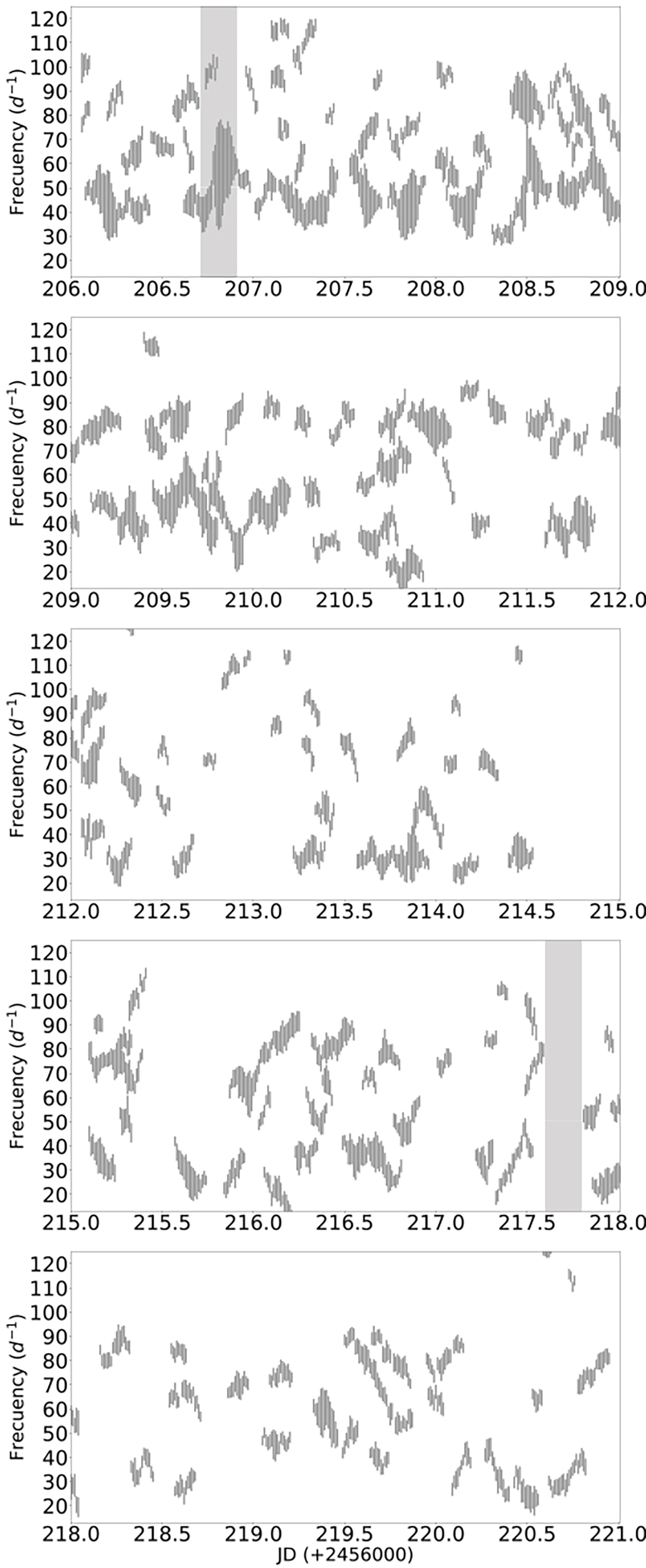
Frequency groups throughout the entire 15 days of observations. Each panel corresponds to a three-day segment. Each line in a group represents a frequency peak in the power spectrum, as explained in Sect. 2.2. The light grey region at JD 206.7 corresponds to the power spectrum analysed in Fig. 2 (top panel), while the filled region at JD 217.7 represents the bottom panel of Fig. 2.
Current usage metrics show cumulative count of Article Views (full-text article views including HTML views, PDF and ePub downloads, according to the available data) and Abstracts Views on Vision4Press platform.
Data correspond to usage on the plateform after 2015. The current usage metrics is available 48-96 hours after online publication and is updated daily on week days.
Initial download of the metrics may take a while.