Fig. 3.
Download original image
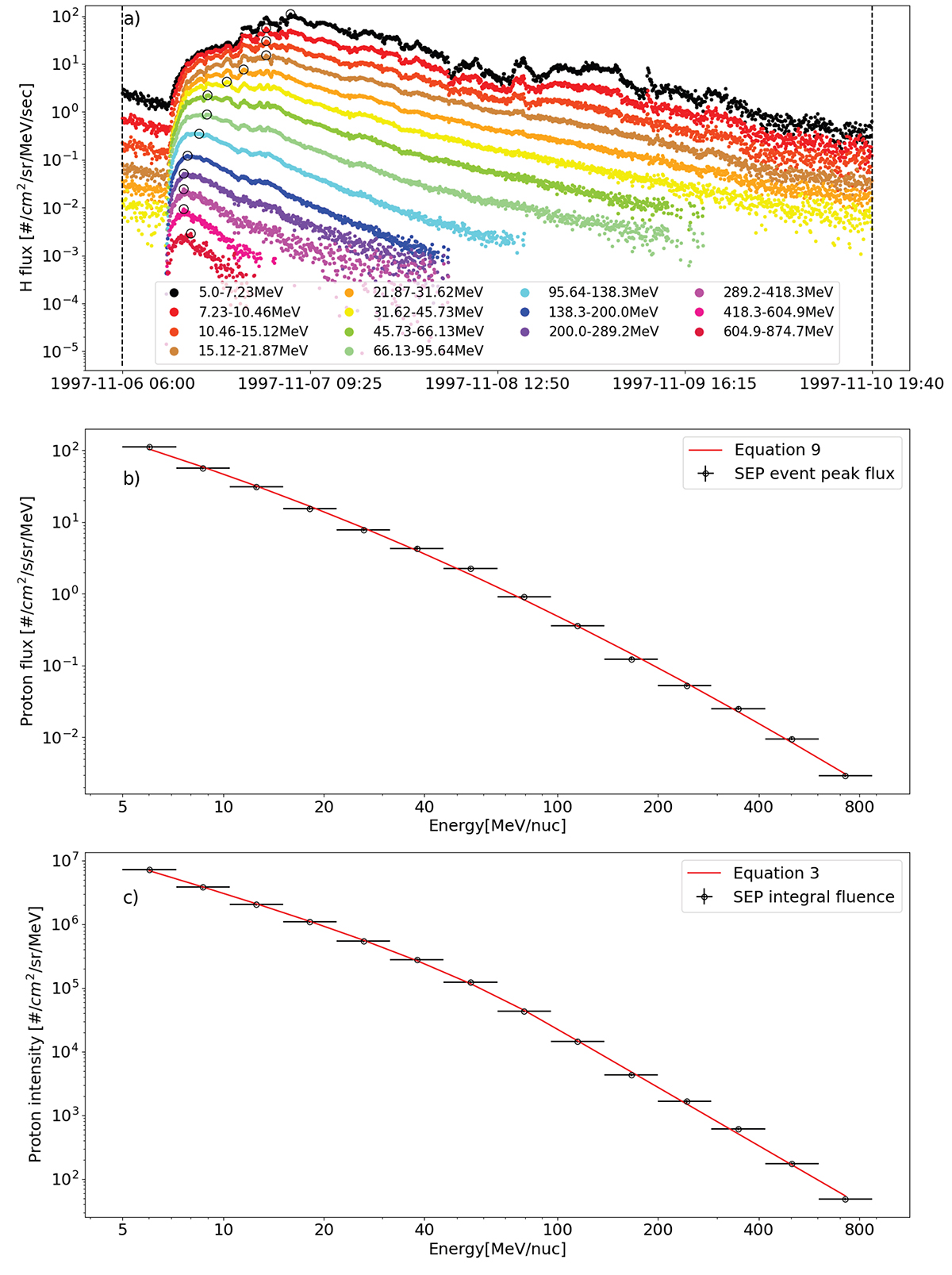
Example of spectrum fitting. Panel a shows the flux time profile of a SEP event during November 1997. The black circles represent the peak flux of each energy bin. The vertical dashed lines indicated the start and end time for the integrated fluence spectrum. Panel b and c show the peak flux spectrum and the integrated fluence spectrum fitting, respectively.
Current usage metrics show cumulative count of Article Views (full-text article views including HTML views, PDF and ePub downloads, according to the available data) and Abstracts Views on Vision4Press platform.
Data correspond to usage on the plateform after 2015. The current usage metrics is available 48-96 hours after online publication and is updated daily on week days.
Initial download of the metrics may take a while.